Sabtu, 06 Juli 2013

Ax-3-Domaines: History, VAMs and performance predictions

Ax-3-Domaines: History, VAMs and performance predictions for the 2013 Tour's first mountain finish

As the Centenary Tour de France enters the Pyrenees for its first mountain finish of the race, we analyze the first major climb, Ax-3-Domaines.  

The data used to produce the figures below was provided by Ammatti Pyoraily, who is a must-follow on Twitter if you are into rapid time performance data, climb profiles, historical records - it's an incredible collection of data, so a huge thank you for providing it.

The climb

Below is the climb, 8.9km long at an average gradient of 7.46%, and divided into five sections.  It starts steeply, 8.9% and 8.3% for the first 1.3 and 2.7km, respectively.  It doesn't drop below 8% until the last kilometer, where it is actually relatively flat.  This has implications for calculated power output (based on models) because they become less accurate as gradient flattens out.  It also means that if the climb is going to separate riders, it will happen lower down, and whoever is together with around 2km to go will probably hang on to the line.  Expect hard efforts early.


The more a climb can be segmented (provided of course the segmentation and timing are accurate), the more accurately a model can be applied.  It also allows differences due to wind direction to emerge.  I recall attending an ACSM conference in 2005 and someone had modelled Alp d'Huez into 21 segment, hairpin by hairpin, and there was a clear impact of a slight wind, because odd numbered segments produced a higher calculated power output than even numbered segments, as the wind shifted from tail- to headwind.  These are some of the assumptions that have to be kept in mind when estimating performance in the mountains.  

Power outputs and performance

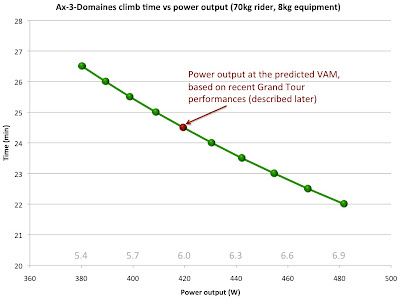
Nevertheless, we can estimate the climbing time for a range of power outputs, as shown by the graph below.   


This was done using the CPL model, but they all produce values that are pretty similar - there's more error in timing and wind assumptions than the actual calculated value.  I chose CPL because it produced the best correlation with SRM data (r = 0.94), and did this for a 70kg rider and 8kg equipment.  Within the relatively narrow range of Tour cyclist sizes, the relative power output is probably the key, shown in grey above the x-axis.

Ax-3-Domaines, at around 24 minutes, is a medium length climb.  On the shorter climbs, we expect higher power outputs.  In 2010, Chris Horner produced 6.6 W/kg for the final 10 minutes of a stage in which he lost about 30 seconds to the leaders, and 5.8 W/kg for 23 minutes of climbing on the steep part of Ax-3-Domaines, losing around 80 seconds to Contador and Schleck.  

Using his power output (which was directly measured with SRM), it is possible to estimate that of the front of the race, and it showed that Contador/Schleck were at around 6.8 W/kg for 10 minutes, and 6.2 W/kg for 24 minutes.  We also know that on Alp d'Huez, the last few ascents have produced around 6 W/kg for 41 minutes, and so it is fairly clear that a) expected power output is affected by duration - you'd think this would be obvious, but sometimes creates confusion and leads people to label performances "impossible" when all you're seeing is a normal high-intensity effort for a shorter period, and b) we can fairly reliably predict where the power output will be for a given length of climb.  

The pVAM method

One such prediction method, developed by Scott Richards and explained here, is the pVAM method.  Basically, what was done was to gather the climbing performance data from the Grand Tours in the period after the biological passport was introduced (2008 to 2013).  He then calculated a VAM, or Vertical Ascension Rate in meters per hour, for every climb for the top 3 in the GC race.

The strength of this method is that it allowed him to develop an equation that not only accounted for the length of the climb, but also the gradient and the altitude - the higher you go, the lower the power output and hence VAM.  The equation was: pVAM = 2938.5 – 0.1124 vclimb + 476.45 ln(gradient)

The pVAM can be thought of as a "benchmark" method, using previous performances to predict current performance in a way that controls for the key variables affecting it.  If a performance is better than historical/typical values, then it will produce a higher actual VAM than pVAM, and so the overall quality of races and performances can be compared.  You'd expect the fastest ascent per climb, and overall GC winner to be better than the pVAM, incidentally, because the pVAM is derived from the best three performances, not the very best on the day, or even overall.

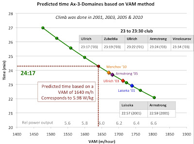
Using the pVAM method for Ax-3-Domaines, the estimated time for the climb is 24:17.  That performance corresponds to a VAM of 1617 m/h, and using Dr Michele Ferrari's equation (which I explained previously here), a power output of 5.98 W/kg.

Historical perspectives

To frame that performance against those of the past, let's take a look back at Ax-3-Domaines, which has been done four times - 2001, 2003, 2005 and 2010.

First, the figure below shows the top 50 times on the climb.


This is a typical figure for Tour mountain climb rankings - heavily weighted towards performances from the 90s and 2000s - you'll see the same for Alp d'Huez when we head into the Alps in a few weeks' time.  We have repeated this often, but the sport has slowed down, sometimes considerably, since the biological passport was introduced co-incident with the greater focus on doping, driven by sponsor and media pressure to eradicate it.  It doesn't guarantee that the sport is clean (in fact, I highly doubt it is), but I do think the performance tells of less doping by fewer riders, and that's progress.

Ax-3-Domaines offers the same "qualified hope" - the top 12 performances pre-date this era (and then it is Menchov), though the climb is too new and infrequent to have the strength of history to really support any historical comparisons.  That's why I'd caution against isolating today's performance, whether it is super fast or slow, and using it as "proof" of anything.  Aside from the fact that performance will never prove clean vs doped, it's important to let the whole Tour unfold, with dozens of mountains, and then look at the climbs in context, with a big picture view.

But what of performance implications?  The figure below shows the climb time as a function of VAM (they're really just the same performance metric, expressed differently) and also relative power output (in grey on the x-axis).  I've indicated the pVAM prediction, and the fastest ascent times in each of the four years in the Tour so that you can get an idea of the power requirement to achieve those performances.  They belong to Laiseka (2001), Ullrich (2003), Armstrong (2005) and Menchov (2010).  Six men have gone under 23:30 on the climb, also shown on the graph below.  


At this point, it's worth noting that for ease of use, I've estimated relative power output based on VAM, as per Ferrari.  This method produces good agreement when a rider is around 65 to 70kg.  For lighter riders, VAM-derived power output tends to under-estimate the performance, whereas for heavier riders, it over-estimates it.  This is because Ferrari didn't account for size (mass and body surface area which affects drag) in his derived equation.  I've actually got some interesting modelling data comparing VAM-power to other models, and perhaps when the Tour leaves the mountains I will explain that more.  But just be mindful, the relative power output that is calculated based on VAM seems to be around 2-3% lower than actual power outputs for the 65-70kg rider producing Tour-performances (speed and duration). That 24:17 prediction, for example, corresponds to 6 W/kg using VAM, but is in reality closer to 6.2 W/kg.

Segment timing and analysis

And then finally, using the climb profile and the five segments, let's look at the best times from those eras and estimate the requirements to produce them.  To repeat, the more segments, the more reliably you can compare and observe possible influence of wind direction on performance.  The figure below shows the best performances per year by segment, for time, VAM and relative power output (bear in mind, this is likely to under-estimate real power output by 2-3%).  I'll leave the year-by-year comparisons to you to make, with the reminder that some of the variance may be due to wind direction.


As would be expected for pretty much any endurance exercise, the beginning and end show the highest power outputs.  This is a typical pacing strategy for endurance sports - start fast, middle lull, then end-spurt.  Ax-3-Domaines probably exaggerates this because of the very steep first 1.3 km and the increase in steepness again in the penultimate kilometer, before it flattens out a little.  That hints at the tactics you'll see later, because it's not the sort of climb where you'd wait for a steep middle section to attack - it'll be hard from the bottom, sustained, and attritional.  Riders will drop off progressively as they pay for the fast start, rather than being split suddenly by mid-climb moves.

In terms of a prediction, I mentioned that the pVAM method predicts a 24:17.  I expect it will be faster than that, because we're only in the first week of the Tour so riders are fresh, it's the first mountain finish so motivation will be higher, and the model prediction is based on three GC riders anyway - the best will be faster.  If I had to gaze into my crystal ball, I'd predict a time between 23:40 and 23:50, corresponding to between 6.2 and 6.3 W/kg.

But, once the day is done, and the times are in, we'll be able to slot 2013 into the figures above, and show all the estimates and actual performances.  If anyone does make SRM data available, I'll also use that to validate the estimates as much as possible.

So enjoy the day's racing and do join me tomorrow for the post-climb analysis, where we can add to the figures above.  Once again, huge thank you to @ammattipyoraily for the numbers and data.

Ross

Jumat, 05 Juli 2013

Froome's non-published TDF power output: "Noise for people who are 'pseudoscientists'?

The non-release of Chris Froome's power output data: Noise or necessary?

Earlier this evening, I tweeted a link to this Dave Brailsford interview, where he explains the reasons behind Chris Froome's refusal to release his Tour de France power outputs.

The article is short, but to sum up in one Brailsford quote, he says the following:
"There is so much pseudo science out there right now. If you release the data, there are very few people who can properly interpret and understand that data. All you’re going to do is create is a lot of noise for people who are pseudo scientists. You can even write magazines about it. They’re so wide of the mark in what they’re doing, it’s quite scary. You can do anything with stats. You can use that with a cynical view".
Later, he adds to it with:
"We look at power numbers every day, and you get these anomalies, you get these quirks, if things are not quite calibrated correctly, or if something else is wrong. All of those things need to be taken into account, just like the biological passport. There is a fruitful area of debate and opportunity in terms of what power data could provide, I am very pro-that, but just releasing it in general is not the right way to go."
I have a few quick thoughts on Brailsford's thoughts:

First, he makes some valid points, particularly the comparison between power and bio-passport data.  There is, without question, "a lot of noise" in power output data, and so the context and calibration are so important - a windy day could make a clean rider look like a doper, and vice-versa.  Historical comparisons (which are the point) are clouded by issues such as those, and so yes, it is possible that those with a cynical view will bend power output numbers to suit their prejudices.

(I'd also add that this cynical view has been earned over many generations by the sport, and so cycling and all its custodians would do well to realize that they can't just ask nicely for optimism and belief - they should, in fact, be encouraging healthy cynicism to lay open the change they argue exists for all to see - the perception of the sport will change when the cynics are won over, not the apathetic or naive.  This is discussion for another time, however)

Brailsford's comparison to the biological passport is thus valid, and so just as the biopassport has rigid parameters and expert review in place, so too proper power output analysis would require stringent control to prevent false interpretations.  No argument from me on that point.

So too, we expect performances to edge forward over time, and so yes, a clean rider will one day match a doped rider from the past.  I'd argue that people are not fools, and would allow for this, and would also be able to tell a normal progression apart from an artificial one.  And finally, you don't need power output to have this particular debate anyway - if a 2013 rider knocks out a 36:30 ascent of Alp d'Huez and displaces Pantani, Riis or Armstrong from the all-time list, a power meter is not exactly a secret weapon - the stopwatch does the job just fine.

However,  while Brailsford's explanations appear sound, I don't believe the subsequent actions are.  The idealistic view that the so-called "noise" can be silenced simply by with-holding the information is naive and false, and only serves to grow suspicion.  If anything, he amplifies the sounds of cynicism with this view, and certainly allows for more voices and thus more noise.  The reality is that Froome will be in the spotlight, as a Tour favorite. His performances are currently seen as the benchmark for the professional cyclists who wish to defeat him, as well as for cycling's fans, who (cynics excluded) want to know the numbers of a potential Tour winner (cyclists are like that!)

And history has shown that people will make up what they are not provided with, and so with-holding the data doesn't silence the noise, it actually increases it.

Filling the silence - if you don't tell them, they make up the truth

Therefore, what Brailsford is currently hearing is noise of cycling's own creation - the secrecy and refusal to talk openly about performance leads to silence that will, for better or worse, be filled by all manner of "experts", some of whom, it must be said, are real experts.  Others are not.  I suspect his main focus of criticism is Antoine Vayer, who recently published a magazine called "Not normal" using the power outputs to cast doubt on the credibility of current performances.  But rather than label these people as "so wide of the mark its scary" (even if he's right), I'd argue that controlling the information is the sensible longer-term strategy.

I remember being involved in the debate around Caster Semenya - was she a male or female?  That saga was crying out for some transparency, and the longer people hid behind the admittedly valid explanation of medical confidentiality, the worse the situation got for Semenya, because there was nothing they could announce that would possibly be worse for her reputation than what people were making up!  There are many other cases like it, and I'd suggest a similar phenomenon for power outputs in the Tour.

And it's not just Froome here - all the GC guys should have it monitored, as has been argued for years.  Currently, no teams make the data available, and this needs to be addressed.  Sky and Froome are the current focus for the discussion, partly because of the BikePure incident and Brailsford's interview.  Also, as the excellent cycling journalist Shane Stokes pointed out on Twitter, Sky came with a promise of transparency in clean cycling,  and are rightly accountable for that.  So for those who feel this singles out Sky, just bear in mind that a) Brailsford gave an interview earlier today, which provides the context,  along with the fact that they dominate the sport's biggest event; b) nobody is saying that Sky should be the only team to release power; and most importantly, c) Sky has an amazing opportunity to deliver on their promise of transparency and to change that cynicism for the whole sport, and instead make statements that lead in the opposite direction

So, the world will watch the Tour, and measure the performances on the climbs.  And, starved of the accurate data, the calibration and the context, they will amplify Brailsford's 'noise' by filling in the blanks for themselves.

Use experts to pro-actively control data and create transparency

Why not take the initiative as a team who want clean cycling, who stand for transparency, and make the data available to experts?  Why not put the data in the hands of experts who can explain to the "pseudoscientists" out there what the difference is between noise and valuable data?  At the very worst, the discussion of data will drive better understanding of those 'quirks and anomalies'.  At best, it will silence the cynics, because they will have the numbers explained to them, and after all, they are pseudoscientists, so should be led towards the truth by those who know better.

What we currently have is a situation where those who claim to have the reliable data, the 'truth', are not sharing it, and leaving the way open for people to do what people will do.  If the team and their experts know the rider to be clean, and if they can explain that "a record ascent was possible because of a tail-wind, and here is the power output data that shows it", then everyone would seem to be better off.

This may be a path towards some compromise - I'm not advocating that they tweet the power output within hours of the finish line, because that is uncontained data, analogous to throwing money at beggars and hoping they spend it wisely.  But there is no reason, in my opinion, that they cannot make the data available weeks after the Tour, and then educate the public, the cynics, the media, and tell the world the story they seem to believe.

For my own part, I plan to analyze performances much as I have since this site began five years ago.  As mentioned in yesterday's post, that will involve historical comparisons, predicted power outputs, implications and any other insights on offer.  I would love to have actual data from a GC contender, and I would make every effort to contextualize and explain the potential variance around that.  But just because Brailsford and co don't see fit to provide that data, the noise will not stop - that is a very naive view.

Rather, if you have a group of 'noise-makers' all playing their instruments individually, get a conductor to pull them together.  The "noise" Brailsford refers to could be converted into a 'melody' if the release of data were controlled pro-actively.  There are experts who could do this, what is lacking is the will.

Ross

Rabu, 03 Juli 2013

The Power of the Tour de France: Performance analysis groundwork

The Power of the Tour de France: Performance analysis, laying the groundwork

The 2013 Tour de France has gotten off to an eventful start, characterized by bus incidents, sprints for yellow jerseys, single-second breakaways claiming yellow, and controversies re timing.  

Soon, the Centenary Tour will hit the mountains, and as has become an annual series here on the Science of Sport, we'll spend some time digging into the rider's performances on those climbs - the times, the estimates for power outputs and their implications.  I can't stress enough that everything we do is estimated, aimed at providing you with some kind of insight as you watch the race develop.  In an ideal world, we would not rely on models that estimate power outputs based on assumptions of bike and rider mass, drafting/wind, and road conditions.  We would instead see the actual data from the front of the race. 

However,  this is unlikely to happen, and so for now we do what is possible, and hope to explain the implicit assumptions as part of the discourse.  As always, it is the process of discussing a subject, not the outcome, that is of value.

So, in order to lay some groundwork before the first mountain stages in the Pyrenees starting this Saturday, I thought I'd try to explain the approach and some of the methods we will use over the course of the next few weeks.

The mountains - times, powers and implications

The Tour de France is won and lost in the mountains, and it's here that the physiology of the best cyclists in the world is best analyzed.  Freed (to some extent, anyway) from the energy savings of drafting on the flat roads, and required to overcome gravity on slopes ranging from 6% to 13%, the power output produced by the cyclist is the key determinant of performance and thus position.

That power output carries with it some important physiological implications, because the whole system, for want of a better term, is 'closed' and it is thus possible to estimate, within a reasonable set of assumptions, what kind of physiology drives a given power output.  That's because we know that the ability to ride at a power output X is the result of a given maximal oxygen carrying capacity, a given mechanical efficiency and a sustainable exercise work rate that is relatively uniform within elite athletes (this last variable could be called any number of things - threshold ability, functional power output etc).   

Therefore, power output reveals underlying physiology.  The problem we have (as outsiders, anyway) is access to data.  I have for four years been saying that I think the credibility of the sport (and its presentation to the viewer) would be greatly enhanced if power output was accurately measured and provided openly.  People argue against this based on the fact that it would make the racing predictable, that the major contenders would know what their rivals are producing and thus change the racing.  I disagree - this is, to me, like saying that the men's 100m final at the Olympics is boring and predictable because we know, within about 1%, what the winning time is going to be.  It doesn't matter that the best 7 men in the world know that Usain Bolt will run around 9.65s, the spectacle is to see how the result is achieved and who competes to change it.  

So, whether cyclists know that winning on Alp d'Huez requires a time of 41 minutes and a corresponding power output of around 6.1 W/kg is immaterial.  And finally, I'd point out that the riders and coaches all know this already - it's not as though Contador will be suddenly enlightened when he discovers that Froome is producing 6 W/kg to ride away from him - he knew it already, it's just that we didn't.  So in my opinion, the power output data would add to the value of the Tour, and certainly, if understood and explained correctly, enhance its credibility, or flag suspicion, that could be used to do so.

Alas, we are not there yet, and so we look to other performance indicators, and estimates, to provide the insight.

Time comparison - what is reasonable?

The power output of course produces the time, and so the first point of analysis is to compare times from one year to the next.  If a rider in 2013 produces an ascent of Alp d'Huez that is faster than anything Pantani, Ullrich, Virenque and Armstrong were able to produce given the doping of that era, then it should be pause for concern and some suspicion.  

This has been an "unpopular" concept because some people assume it to be the equivalent of guilt based on performance - if you are too fast, you must be doping.  That's not entirely true, though it would be almost patronizing to say that there isn't an element of truth in it.  The reality, as far as I'm concerned, is that in the past, doping exerted such a large effect on performance that it pushed performances beyond what is possible with normal physiology.  Recent work by Pitsiladis suggests that EPO use improves endurance performance by around 5%, and that's for relatively short duration endurance.  It may be greater in the Tour, and so you have this shift in capacity that moves performances beyond what is normal.  So I do subscribe to the belief that what happened in the 90s and 2000s cannot be overcome by normal training, however gifted an athlete may be.  

In time, advances in training, technology and preparation may slowly erode that advantage, but within a narrow period of a few generations, the effect of the doping seen in cycling in the 90s and early 2000s was so large that I don't believe it possible to match doped performances, and so if or when it happens, some very important questions must be asked.  Certainly, in the last few years, every Grand Tour has experienced a "slowing down", and the times in the Giro, Tour and Vuelta have been, with one or two exceptions, slower than they were prior to the biological passport's introduction.  In 2011, I wrote a piece for the New York Times describing this and since then, the performances have remained slower.  Not proof of a clean sport, by any means, but an encouraging sign.

Returning to the issue of 'guilt by outstanding performance', it's important to understand that because the analysis of times does not always account for race tactics, environment and other contexts, no rider can ever be declared guilty of doping based on times (and resultant estimates of power output alone).  There can be no judgment, only informed questioning.  I remember a few years ago, Alberto Contador produced an amazingly fast ascent of Verbier, leading to accusations of doping.  As it turned out, they were true...!  However, that particular climb was not the 'proof' people said it was, because it benefitted from being very short in duration, with a strong wind from behind, and so the performance was inflated and thus wrongly compared to climbs like Alp d'Huez.  

The point is, as the next few weeks unfold, I will report on the climbing times, past and present, and comparing what Froome and Contador and co produce in 2013.  However, these are only indicators, and once the context is understood, then we can begin to understand their implications.  I'll say this - if anyone rides anything close to what the doped generation does, I'll be among the first to raise those uncomfortable questions.

Power output: Some basic concepts

The graph below, which I've drawn based on data provided by the Cycling Power Lab website, shows the estimated time on the Tour's first big mountain finish, Ax-3-Domaines, as a function of the power output produced for two riders, one at 64kg and one at 70kg.


For the uninitiated, the graph shows that mass matters in mountains.  Climbers don't want to carry weight, because at the same power output (say, 400W - follow the blue line up) the estimated time is around 1 min faster for the 64kg rider.  That's why relative power output matters - with some fineprint, it's the power output produced per kilogram that tells in the mountains. That 400W performance corresponds to 6.25 W/kg for the 64kg rider, whereas it's only 5.7 W/kg for the 70kg rider.

In order for the 70kg rider to match the 64kg, he'd need a similar relative power output (6.25 W/kg), which corresponds to around 435 W (red dashed lines). 

pVAM, residuals and the Ferrari equation

Now, in terms of what is considered a reasonable performance, in addition to historical comparisons, we can also begin to model what power outputs are considered 'reasonable'.

Over at the Veloclinic, you can find what has been defined as the pVAM, or Predicted Vertical Ascension meters.  This metric, which is expressed as meters per hour, originates with the notorious Dr Michele Ferrari, but it's a contribution he made to the sport that is actually worth considering.

Basically, what Ferrari would have done over a few years, with many cyclists, is derive an equation that models the climbing rate in vertical meters per hour against the measured power output.  VAM is easy to calculate - if a climb starts at 200m and tops out at 1200m, the vertical climb is 1000m.  If that's done in 40 minutes, VAM is 1500 m/hour.

Once an equation for the relationship between power output and VAM exists (this is a simple regression analysis), you would no longer need to measure the power output directly.  Instead, you could estimate it based on the known climbing rate. 

That climbing rate, or VAM, is a function of a few things, but primary among them is the gradient - a steep climb will, for the same power output, produce a higher VAM, and that's why Ferrari's equation looks as follows:

Calculated power output (W/kg) = [VAM (m/hour)] / [((2 + (% grade/10)) x 100)]

Example: if VAM = 1600m/h, and the gradient is 7.46%, then the equation is:
W = 1600/(((2+7.46/10)*100)) = 5.83 W/kg

Now, important to realize is that on longer climbs, we would expect that the power output will be lower, and thus our expectation for VAM should also be lower.  Similarly, altitude affects performance, and so the greater the altitude of a climb, the lower the predicted power output and VAM.

The Ferrari equation does not account for this, but at Veloclinic, a new equation for pVAM has been estimated.  It is as follows:

pVAM = 2885.17 + 416.825 ln Gradient - 0.06197 VClimb - 0.08796 Altitude (as per Doc, Veloclinic)

That equation, incidentally, was derived from an analysis of climbing times in the period 2008 to present, and so it assumes (probably not entirely correctly) that the performance is "unaided" by doping.  Certainly, I think it's a reasonable assumption when compared to the period before it, 2002 to 2007, which Doc has worked out as a dVAM, or predicted VAM with doping (all of this is explained, if you can bypass the strange language, at this link), but not altogether 'pure'.

Nevertheless, the genius of this method is that it allows every climb to be predicted, accounting for the factors that most strongly influence the performance.  Then, the actual performance can be compared to predicted performance to reveal historically strong or weak performances.  Doc at Veloclinic does this, and he calls it the residual.  If a performance is better than the prediction, you will get a positive difference/residual (for example, a guy climbs at 1640 m/h when the pVAM was 1600 m/h, the residual is + 2.5%).

One need not even convert VAM to power output for this to have meaning - the metric is basically the same as time, provided the climb is measured accurately and length and vertical height gain are known at specific time points.

Doing this, one can now draw the following graphs, again showing the estimated time for Ax-3-Domaines, this time as a function of pVAM (left panel) or calculated power output (right panel).  You may have to click to enlarge.


So, the method predicts a time of 24:17 for the 8.9km climb, based on a pVAM of 1640 m/hour.  That corresponds, per Ferrari's equation, to a relative power output of 5.98 W/kg, which is near enough that 6 to 6.2 W/kg limit you may have heard of so often.

That limit, incidentally, is something I've written on a great deal in the past, but will refer you to this post and the links it contains for more detail on this subject.

Briefly, however, the premise here is that in order to produce 6.2 W/kg or higher for longer than about 30 minutes requires physiology that is, frankly, not seen in normal situations.  That doesn't mean it's not possible, but to illustrate, in order to ride at this kind of power output, a cyclist must have a VO2max that is tremendously high, in combination with an exceptional efficiency, and the ability to sustain upward of 85% of VO2max for those 30 minutes or more, at the end of a 5 hour stage.  The combination of physiological factors does not, in my opinion, exist in order to validate power outputs above 6.2 W/kg for those durations.  

On shorter climbs, in the range of 10 to 20 minutes, it is absolutely expected that these power outputs will be recorded.  But on the HC climbs that end the big mountain stages, I would be very, very skeptical of anything above those values.  

The pVAM method accounts for the length, altitude and gradient, and the physiological method explains some of the implications of those power outputs, which I don't believe are reasonable.  Thus, if the Tour is clean (and how big an 'if' that is depends on your point of view, your disillusionment with the sport and your cynicism), then we expect to see power outputs in the range of 5.9 W/kg to 6.1 W/kg for the HC climbs.

Looking ahead - what to expect from analysis here on The Science of Sport

During the Tour, what I'll do ahead of each mountain stage is graphically show you the expected times, and the expected power outputs.  Then, after the stage, once the data are in, we can compare each climb to the various predictions, and describe again the insights the performances offer.

Again, I can't stress enough that this is not done with judgment of performance in mind.  It's partly because the study of the limits of performance is fascinating, and partly because we can develop informed, insightful opinions on the state of the sport by understanding the power output.  I confess, upfront, and will continue to do so as the race develops, that these are imperfect methods, involving estimates and assumptions.  Where possible, I will provide actual SRM data to validate the models (or reveal their inaccuracies), and hopefully by the time the Tour rolls into Paris in just under 3 weeks, we'll all be better for it.

It is a busy time of year for me, so I will also apologize in advance if I can't keep up with very stage of the race - these long posts obviously draw significant time away from other responsibilities, so no guarantees!  I will however guarantee that I'll share brief thoughts and the insights and analysis of others over at our Twitter and Facebook pages, so do follow us there if you would like more frequent, shorter thoughts during this 100th Tour de France.

Until the Pyrenees begins on Saturday, and our first prediction series, enjoy the racing!

Ross

Addendum - the accuracy of Ferrari's VAM

 The accuracy of this method is an important question.  Based on some data sent to me recently, I plotted Ferrari's estimated power output against actual SRM data and found a relatively strong correlation (r = 0.86) between the two.  The range of error was between -5% and +5%, which means that on any given climb, the estimate by Ferrari could be around 20 W different to the SRM value.  That's likely because Ferrari's method is a function of time, and so a tailwind would lower the time, raise the VAM and hence the calculated power output, leading to over-estimation.  Similarly, a head wind (or solo effort which is denied some drafting benefit) might lead to under-estimate.  These are, to repeat,all reasons why this kind of analysis must be done sensibly and always with context and specific situations in mind.


Senin, 01 Juli 2013

An illustration of the waist-to-weight ratio theory: The fit2fat2fit experiment


In my previous blog post, I argued that one’s optimal weight may be the one that minimizes one’s waist-to-weight ratio. I built this argument based on the fact that body fat percentage is associated with lean body mass (and also weight) in a nonlinear way.

The fit2fat2fit experiment (), provides what seems to be an interestingly way to put this optimal waist-to-weight ratio theory to test. This is due to a fortuitous event, as I explain in this post.

In this experiment, Drew Manning, a personal trainer, decided to undergo a transformation where he went from what he argued was his fittest level, all the way to obese, and then back to fit again. He said that he wanted to do that so that he could better understand his clients’ struggles. This may be true, but it looks like he planned very well his experiment from a marketing perspective.

His fittest level was at the start, with a weight of 193 lbs, at a height of 6 ft 2 in. That was his fittest level according to his own opinion. At that point, he had a waist of 34.5 in, and looked indeed very fit (). At his fattest level, he reached the weight of 264.8 pounds, with a 47.5 waist.

As he moved back to fit, one interesting thing happened. Toward the end of this journey back to fit, he moved past the level that he felt was his optimal. He dropped down to 190.1 lbs, and a 34 in waist; which he perceived as too skinny. He talks about this in a video ().

As a self-defined “fanatic” personal trainer, I figured that he knew when he had gone too far. That is, he is probably as qualified as one can get to identify the point at which he moved past his optimal. So I thought that this would be an interesting way of putting my optimal waist-to-weight ratio theory to the test.

Below is a bar chart showing variations in waist-to-weight ratio against weight for Drew Manning during his fit2fat2fit experiment. I included only three data points in this chart because I would have to view all of his video clips to get all of the data points.


As you can see, at the point at which he felt he was too thin, his waist-to-weight ratio clearly started going up from what seems to have been its optimal at 34.5 in / 193 lbs. This is exactly what you would expect based on my optimal waist-to-weight ratio theory. You probably can’t tell that something was not right at that point, because he looked very fit.

But apparently he felt that something was not entirely right. And that is consistent with the idea that he had passed his optimal waist-to-weight ratio, and became too lean for his own good. Note that his waist decreased, and probably could go down even further, even though that was no longer optimal.

Senin, 24 Juni 2013

A failure of knowledge marketing: The example of obesity with physical activity

The failure of knowledge marketing: The example of obesity and activity

For the last six weeks, I've been on and off aeroplanes flying between Europe, Africa and the USA for a series of conferences on science, high performance, coaching and more science.  It's been a stimulating and challenging period, one which has entrenched a realisation about the value of sports science that I've been developing for a while now, namely that the effectiveness of science is primarily dependent on how well it is 'sold' to prospective 'end-users', be they coaches, high performance managers, policy-makers in government or athletes.

Today, reading through a few local papers, I came across a report that is the catalyst for some further thoughts on this subject, and below are some of my thoughts on it, which use the specific example of obesity and physical activity, but which are equally relevant to high performance strategies and the delivery of science to elite athletes.

The report described the recommendation of a review led by Baroness Tanni Grey-Thompson into the growing obesity problem in Wales, and its findings can be summarised into one sentence:  Give Physical Education a standing in schools that is comparable to maths and science in order to tackle the obesity problem.

First of all, I must say that I don't think any complex problem can be reduced to a single solution.  It certainly would be part of it, but I believe a similar action was taken in Australia without effect, and that's because changing people's behaviour is never a simple matter of introducing a compulsory change.  Simple solutions are desirable, but rarely effective by themselves.

Granting core status to physical education would apparently cost 5 million pounds per year, which the report argued is trivial compared to the current cost of 73 million pounds spent on obesity and related conditions (This assumes of course that the programme would save 5 million pounds per year on those costs to at least break-even - they may have done these projections, I'm not sure)

This is not a new concept - reviews have recommended prioritizing physical activity before, and I have no doubt they will do it again.  The removal of physical education from schools (as a subject, let alone a core subject) in South Africa is constantly bemoaned as one of the key moments in our own battle with obesity, yet change seems incredible slow.  Similarly, around the world, there is nothing revolutionary about the idea that growing levels of inactivity need to be addressed.  What is revolutionary is actually doing it, which few have.

A marketing challenge - why wouldn't you drink the iced tea?

The biggest challenge when attempting to change behavior and policy, be it high performance sport related, which is my primary interest, or physical activity, such as this illustration of obesity and physical activity, is bridging the gap between people's intellectual understanding and their desire to act upon it.  It is one thing to know a problem exists, and even how to solve it.  Another is making the decision to solve it, and then doing it, particularly when there is a cost attached, and that cost must be weighed up against others in terms of 'leverage', or return on investment.

Yes, one can argue for the potential financial savings when comparing the cost of promotional campaigns and policy changes compared to the cost of obesity and its associated diseases to health care.    Yes, we can provide data that shows how workplace productivity increases with increased physical activity (absenteeism and presenteeism, for instance).  Yes, we can even find relatively short-term success stories with which to inspire change.

But the fact that this debate keeps circling back on itself (the Grey-Thompson review is not the first, and nor will it be the last of its kind to promote physical education in schools) suggests that action rarely follows data or words.

Part of this is because decision-makers often have many interwoven problems to deal with, and they can't (or don't) view a solution to a particular problem in isolation.  Their decision-making process is tangled because of overlapping challenges and the conflict this creates for resource allocation.  Consider for instance the response to the Grey-Thompson report by one senior figure in Welsh education:

"Dr Philip Dixon, director of education union ATL Cymru, warned that literacy and numeracy was of most pressing concern in Wales and overloading the curriculum with core subjects could prove counterproductive"

In other words, physical activity is one of many concerns, and is a lesser problem in the larger scheme of things.  He has weighed up A vs B and decided which requires prioritisation   That is a fair concern, because adding physical activity means, in a 'zero-sum' decision-making world (which it often is), taking away from something else.  Unless an hour a day could be added to the school year, and unless more money could be found, implementation of one solution means another is overlooked or compromised.  This is, as an aside, why talent identification systems in sport are so complex - if you spend more on the selected individuals, it means less on the non-selected players, and vice-versa, making the balance and requirement for selection so important.

However, the case could still be made, and has been, for physical activity, that the benefits are not only large but essential.  With 36% of Welsh children obese (and it's even greater in other parts of the world), and with the cost of diseases associated with obesity sky-rocketing to levels that may cripple health care, you'd think the urgency would exist.

Yet still, decision-makers seem stuck in second gear.  They may know a solution, and even be intellectually aware of its value, but unable to act upon it.  And when I see that, it always strikes me that the likeliest explanation, here in SA anyway, is that the people who hear the message don't fully understand a) their need, or b) its value.  That is a failure of marketing, not science.

If I staggered into your house having been stranded in the desert for 3 days without water, on the verge of death, and you offered me a bottle of iced tea, which I've never tasted, the only circumstances under which I'd refuse it are:

a)  I don't trust you not to poison me with an unfamiliar drink, or;
b)  I don't understand what you are offering.  I have no experience with iced tea, I don't know what it does, tastes like, or why it may be of value to me.  Therefore I decline, because my perception of its value is lower than my awareness of my need for it.

Now, to return to the overlapping decision analogy, imagine you offered me a choice between iced-tea and a wet sponge.  The decision is more complex, because I have to choose between two options.  If you made me pay for it, then it becomes even more complex, because my decision depends not only on the perceived product benefit, but also the cost to me (we make these cost-benefit decisions all the time - early start to your day, running late for work, you might spend $6 on a cup of coffee because it's the only available option, where normally you'd balk at $4)

So it comes down to customer-perceived value, in that people will not 'buy' unless they perceive the value to be greater than the cost.  In a "competitive" market, where they have a choice of purchases, it is even more important to communicate the value (or reduce the cost, of course).

This is, in my experience, the biggest problem facing sports science and its application to high performance teams, coaches and the public.  We can argue with data all we want, we can promote the merits of our ideas, be they scientific analysis of performance, the health benefits of physical activity, the cost savings to health care, or the scientific monitoring of athletes in Olympic competition.  But until the potential customer genuinely recognizes the value, and establishes a deeper, almost emotional connection with it, the data will have minimal impact.  Sports scientists of course have this connection - they are already converts, and cannot imagine how anyone would not see the value.  But this is a little like me not understanding how anyone would prefer BMWs to Audis just because I drive an Audi.

In a competitive market, communication swings decisions, not 'truth'

Last year in September, I attended a conference at which Kenneth Cooper presented some of his data from decades of being involved in physical activity work in the USA.  He showed data that obesity had risen steadily since he founded his Cooper Institute.  Somehow he was claiming credit for helping combat obesity, even though the line of obesity over the years was snaking its way steadily towards the top right of the graph.

Then, a few years ago, the NFL partnered with a few campaigns to promote physical activity in children.  They made use of some recognizable NFL stars and sent the message out to get active, eat better.  The result was the first dent in the obesity growth rate.  And while causation is difficult to infer, Cooper himself acknowledged the impact made by this marketing campaign.  The message I took from that is that all our science, data, knowledge and educational campaigns can be matched by a creative campaign using a method of communication that children really value.

This is the power of marketing.  It is the reason that the 10,000 hour concept is so powerful even among coaches and high performance managers - Gladwell and Syed spun a story around data, not letting the facts get in the way of that story, and it was more effective than published research that said the opposite.  It's the reason Power Balance bracelets catch on like wildfire despite our best attempts as scientists to explain the fallacy in theory and practice behind them.  Conversely, the failure to creatively and accurately market sports science is the reason that so many coaches and high performance managers reject scientific support - they simply do not perceive its value relative to its cost.

My point is this:  As scientists, whether we are involved in sports performance, health and physical activity, education, even conservation of the environment and other scientific pursuits, if we cannot also market the knowledge, then we will be ineffective.  And we will always be vulnerable to decisions and people who do it better, even when their "product" is inferior and their truth, well, untrue.

So the challenge is not merely to know the truth, it is to sell the truth.  That is a difficult balance because salesmanship almost always compromises integrity, which is why I hate advocacy and extremism - it is often the sale mentality that drives it.  But if there is one thing that each individual can change, it is the method of communication of science and its value.

Sometimes, the value is purely financial, in which case the decision will be made based on income, expenses and profit - show the decision-maker how much money they will save by implementing athlete monitoring or physical activity.  On that note, be aware of who makes the decision because your compelling argument may be borderline irrelevant to the person you're talking to.  One of the problems for the advocacy of physical activity in schools is that one of the common arguments is the financial saving because it will reduce the cost of health care.  But education decision-makers are not obliged to care about this, it's not their incentive.  It's a health department issue, so the right message is being given to the wrong people!

Other times, the decision is emotive, bordering on folly, or its the high performance managers' desire to use technology, to do what nobody else can, and the level of evidence is less important than the 'glamour' and innovation behind it.  The challenge for all those reading this who are trying to find a foothold in sport and health as a scientist is to recognize the specific need of the person you are talking to, and offer the right thing to the right person at the right time.  We simply have to do better at marketing our own value.

Hopefully, the decision-makers recognize the value of physical activity.  It'll take a lot more than statistics, however compelling, about cost and benefit, however.  Forgive me if you are already a 'convert' and think all these concepts are self-evident.  I suspect that many reading this are, because it's why you're here!  But in South Africa, and dare I say it in many other places, the value is undersold and sports science scratches its collective head wondering why others don't see the world the way it does!

Ross

Senin, 17 Juni 2013

What is your optimal weight? Maybe it is the one that minimizes your waist-to-weight ratio


There is a significant amount of empirical evidence suggesting that, for a given individual and under normal circumstances, the optimal weight is the one that maximizes the ratio below, where: L = lean body mass, and T = total mass.

L / T

L is difficult and often costly to measure. T can be measured easily, as one’s total weight.

Through some simple algebraic manipulations, you can see below that the ratio above can be rewritten in terms of one’s body fat mass (F).

L / T = (T – F) / T = 1 – F / T

Therefore, in order to maximize L / T, one should maximize 1 – F / T. This essentially means that one should minimize the second term, or the ratio below, which is one’s body fat mass (F) divided by one’s weight (T).

F / T

So, you may say, all I have to do is to minimize my body fat percentage. The problem with this is that body fat percentage is very difficult to measure with precision, and, perhaps more importantly, body fat percentage is associated with lean body mass (and also weight) in a nonlinear way.

In English, it becomes increasingly difficult to retain lean body mass as one's body fat percentage goes down. Mathematically, body fat percentage (F / T) is a nonlinear function of T, where this function has the shape of a J curve.

This is what complicates matters, making the issue somewhat counterintuitive. Six-pack abs may look good, but many people would have to sacrifice too much lean body mass for their own good to get there. Genetics definitely plays a role here, as well as other factors such as age.

Keep in mind that this (i.e., F / T) is a ratio, not an absolute measure. Given this, and to facilitate measurement, we can replace F with a variable that is highly correlated with it, and that captures one or more important dimensions particularly well. This new variable would be a proxy for F. One the most widely used proxies in this type of context is waist circumference. We’ll refer to it as W.

W may well be a very good proxy, because it is a measure that is particularly sensitive to visceral body fat mass, an important dimension of body fat mass. W likely captures variations in visceral body fat mass at the levels where this type of body fat accumulation seems to cause health problems.

Therefore, the ratio that most of us would probably want to minimize is the following, where W is one’s waist circumference, and T is one’s weight.

W / T = waist / weight


Based on the experience of HCE () users, variations in this ratio are likely to be small and require 4-decimals or more to be captured. If you want to avoid having so many decimals, you can multiply the ratio by 1000. This will have no effect on the use of the ratio to find your optimal weight; it is analogous to multiplying a ratio by 100 to express it as a percentage.

Also based on the experience of HCE users, there are fluctuations that make the ratio look like it is changing direction when it is not actually doing that. Many of these fluctuations may be due to measurement error.

If you are obese, as you lose weight through dieting, the waist / weight ratio should go down, because you will be losing more body fat mass than lean body mass, in proportion to your total body mass.

It would arguably be wise to stop losing weight when the waist / weight ratio starts going up, because at that point you will be losing more lean body mass than body fat mass, in proportion to your total body mass.

One’s lowest waist / weight ratio at a given point in time should vary depending on a number of factors, including: diet, exercise, general lifestyle, and age. This lowest ratio will also be dependent on one’s height and genetic makeup.

Mathematically, this lowest ratio is the ratio at which d(W / T) / dT = 0 and d(d(W / T) / dT) / dT > 0. That is, the first derivative of W / T with respect to T equals zero, and the second derivative is greater than zero.

The lowest waist / weight ratio is unique to each individual, and can go up and down over time (e.g., resistance exercise will push it down). Here I am talking about one's lowest waist / weight ratio at a given point in time, not one's waist / weight ratio at a given point in time.

This optimal waist / weight ratio theory is one of the most compatible with evidence regarding the lowest mortality body mass index (, ). Nevertheless, it is another ratio that gets a lot of attention in the health-related literature. I am talking about the waist / hip ratio (). In this literature, waist circumference is often used alone, not as part of a ratio.

Senin, 03 Juni 2013

Dr. Jekyll dieted and became Mr. Hyde


One of the most fascinating topics for an independent health researcher is the dichotomy between short- and long-term responses in successful dieters. In the short term, dieters that manage to lose a significant amount of fat mass, tend to feel quite well. Many report that their energy levels go through the roof.

A significant loss of fat mass could be considered one of 30 lbs, or 13.6 kg. This is the threshold for weight loss used in the National Weight Control Registry. Ideally you want to lose body fat, not lean mass, both of which contribute to weight loss.

So, in the short term, significant body fat loss feels pretty good for the dieters. In the long term, however, successful dieters tend to experience the symptoms of chronic stress. This should be no surprise because some of the same hormones that induce a sense of elation and high energy are the ones associated with chronic stress. These are generally referred to as “stress hormones”, of which the most prominent seem to be cortisol, epinephrine (adrenaline), and norepinephrine (noradrenaline).

Stress hormones display acute elevations during intense exercise as well ().

This is all consistent with evolution, and with the idea that our hominid ancestors would not go hungry for too long, at least not on a regular basis. High energy levels, combined with hunger, would make them succeed at hunting-gathering activities, leading to a period of feast before a certain threshold of sustained caloric restriction (with or without full fasting) would be reached. This would translate into a regular and cyclical hunger-feast process, with certain caloric costs having to be met for successful hunting-gathering.

After a certain period of time under sustained caloric restriction, it would probably be adaptive among our ancestors to experience significant mental and physical discomfort. That would compel our hominid ancestors to more urgently engaged in hunting-gathering activities.

And here is a big difference between those ancestors and modern urbanites: our ancestors would actually be working towards getting food for a feast, not restraining themselves from eating what they have easily available at home or from a grocery store nearby. There are major psychological differences here. Dieting, in the sense of not eating when food is easily available, is as unnatural as obesity, if not more.

So what are some of the mechanisms by which the body dials up stress, leading to the resulting mental and physical discomfort? Here is one that seems to play a key role: hypoglycemia.

Of the different types of hypoglycemia, there is one that is quite interesting in this type of context, because it refers to hypoglycemia in response to intake of any food item that raises insulin levels; that is, food that contains protein and/or carbohydrates. More specifically, we are referring here to reactive hypoglycemia, of the same general type as that experienced by those on their way to type II diabetes.

But reactive hypoglycemia in successful dieters is often different from that of prediabetics, as it is caused by something that would sound surprising to many: successful dieters appear to become too insulin sensitive for their own good!

There is ongoing debate as to what is considered a blood glucose level that is low enough to characterize hypoglycemia. Several factors influence that, including measurement method and age. One important factor related to measurement method is this: commercial fingerstick glucose meters tend to grossly underestimate low glucose levels (e.g., 50 mg/dl shows as 30 mg/dl).

Having said that, glucose levels below 60 mg/dl are generally considered low.

Luyckx and Lefebvre selected 47 cases of reactive hypoglycemia for a study, from a total of 663 standard four-hour oral glucose tolerance tests (OGTT). They classified these 47 cases as follows, with the number of cases in each class within parentheses: obesity (11), obesity with chemical diabetes (9), postgastrectomy syndrome (3), chemical diabetes without obesity (1), renal glycosuria (7), and isolated reactive hypoglycemia (16).

Postgastrectomy is the period following a gastrectomy, which is removal of part of one’s stomach. The modern term for this stomach amputation procedure is “bariatric surgery”; admittedly a broader term, which many people say they would do as if they were referring to a walk in the park!

In the cases of isolated reactive hypoglycemia, the individuals had normal weight, normal glucose tolerance, and no glycosuria (excretion of glucose in the urine). As you can see in the paragraph above, this, isolated reactive hypoglycemia, was the category with the largest number of individuals. The figure below illustrates what happened in these cases.


The cases in question are represented in the left part of the graph with dashed lines (the full lines are for normal controls). There a reasonably normal insulin response, lower in fact in terms of area under the curve (AUC) than for the controls, leads to an abnormal reduction in blood glucose levels. They are 9 out of 16, the majority of the isolated reactive hypoglycemia cases. In those 9 individuals, insulin became “more potent”, so to speak.

Reactive hypoglycemia is frequently associated with obesity, in which case it is also associated with hyperinsulinemia, and caused by an exaggerated insulin response. About 40 percent of the reactive hypoglycemia cases in the study were classified as happening in obese individuals.

This study suggests that, if you are not obese, and you are diagnosed with reactive hypoglycemia following an OGTT, chances are that the diagnosis is due to high insulin sensitivity – as opposed to low insulin sensitivity, coupled with hyperinsulinemia. A follow-up test should focus on insulin levels, to see if they are elevated; i.e., to try to detect hyperinsulinemia.

I have been blogging here long enough to hear from people who have gone the full fat2fit2fat cycle, sometimes more than once. They start dieting, go from obese to lean, feel good at first but then miserable, drop the diet, become obese or almost obese again, then start dieting again …

Quite a few are folks who do things like ditching industrial foods, regularly eating organ meats, and doing resistance exercise. How can you go wrong doing all of these, generally healthy, things? Well, they all increase your insulin sensitivity. If you don’t build in plateaus to slow down your progress, you may not give your body enough time to adapt.

You may become too lean, too fast, for your own good. The more successful the diet, the bigger is the risk. No wonder the paleo diet is being targeted lately as a “bad” diet. How can you go wrong on a diet of whole foods; “real” whole foods, not “whole wheat”? Well, here is how you can go wrong. The diet, if not managed properly, may be too successful for your own good; too much of a good thing can be a problem, you know!

See the graph below, from a previous post on a related topic (). I intend to discuss a method to identify the point at which weight loss should stop, in a future post. This method builds on the calculation of a simple index, which is unique to each individual. Let me just say now that I suspect that, with exceptions, frequently people are hurting their health by trying to have six pack abs.


But what does all this have to do with stress hormones? The connection is this. Hypoglycemia is only “felt”, as something unpleasant, due to the body’s frequent acute stress hormone response to it. Elevated levels of stress hormones also increase blood glucose levels, countering hypoglycemia. Our body’s priority is preventing hypoglycemia, not hyperglycemia ().

And here is an interesting pattern, based on anecdotal evidence from HCE () users. It seems that folks who have abnormally high insulin sensitivity, also have medium-to-high HbA1c (a measure of glycation) and fasting blood glucose levels. By medium-to-high HbA1c levels I mean 5.7 to even as high as 6.2.

Since cortisol is elevated, one would expect higher fasting blood glucose levels – the “dawn phenomenon”. But higher HbA1c, how? I am not sure, but I believe that HbA1c will be found in the future to be something a bit more complicated than what it is believed to be: a measure of average blood glucose over a period of time. I am not talking here about cases of anemia.

One indication of this complicated nature of the HbA1c is the fact that blood glucose levels in birds are high yet HbA1c levels are low, and birds live much longer than mammals of comparable size (). Some birds have extremely high glucose levels, even carnivorous birds who consume no or very small amounts of carbohydrate (e.g. hawks), with fairly low HbA1c levels.

The title of this post is inspired in the classic short novel “Strange Case of Dr. Jekyll and Mr. Hyde” by the Scottish author Robert Louis Stevenson; who also authored another famous novel, “Treasure Island”. In “Dr. Jekyll and Mr. Hyde”, gentle Dr. Jekyll becomes nasty Mr. Hyde (see poster below, from Wikipedia).


Mr. Hyde had a bad temper, impaired judgment, and was prone to criminal behavior. Hypoglycemia has long been associated with bad temper, impaired judgment, and criminal behavior (, ).