Tampilkan postingan dengan label diabetes. Tampilkan semua postingan
Senin, 23 Februari 2015
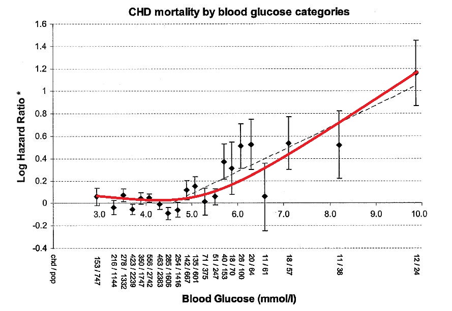
What is the probability that you are NOT diabetic if your fasting blood glucose is 110-126 mg/dl?
Often I hear from readers who have changed their diets and lifestyles toward a more evolutionarily sound direction () that their fasting blood glucose (FBG) readings have gone up. Frequently numbers in the range 110-126 mg/dl (6.1-7 mmol/l) are mentioned.
If you have a FBG reading of 110-126 mg/dl (6.1-7 mmol/l) very likely your doctor will tell you that you are either diabetic or well on your way be becoming diabetic.
Diabetes is a condition that in humans is most frequently associated with damage to the beta cells in the pancreas, significantly impairing insulin secretion. With limited insulin, glucose levels tend to go up, leading to high FBG levels and high glucose peaks after consumption of carbohydrates. The latter, high glucose peaks, appear to be particularly damaging when happening regularly over time.
What is the probability that you are NOT diabetic with this FBG reading?
I put together the table below, based on data from a widely cited meta-analysis () conducted by the research group called The Emerging Risk Factors Collaboration. It shows the distribution of FBG levels in urban settings among individuals who do not have diabetes.
The numbers in this table are fairly consistent with those from various other surveys of large numbers of individuals in urban settings.
The study mentioned above also tells us that the incidence of diabetes in urban populations is in the neighborhood of 6.8 percent. This may not sound like much, but as disease incidences goes, it is very high – approximately 1 in every randomly selected group of 15 people has diabetes.
The vast majority of those diagnosed will have diabetes mellitus type 2, which tends to develop over time and be associated with the metabolic syndrome ().
We know from Bayes' theorem, which is a fundamental element of the increasingly popular Bayesian statistics, that the probability of an event A given that an event B has occurred [denoted P(A|B)] is given by:
P(A|B)=P(B|A)*P(A)/P(B).
In the equation above, P(B|A) is the probability of event B given A, P(A) is the probability of event A, and P(B) is the probability of event B.
To answer the question posed in the title of this blog post, we need to calculate the probability that a person will have no diabetes given that he or she has a fasting blood glucose of 110-126 mg/dl.
Replacing A and B in the equation above with “NoDiabetes” (short for not having diabetes) and “FBG=110-126 mg/dl” respectively, we arrive at the formula to calculate the probability that answers the question:
P(NoDiabetes|FBG=110-126 mg/dl)=P(FBG=110-126 mg/dl|NoDiabetes)*P(NoDiabetes)/P(FBG=110-126 mg/dl).
From the table above we know that P(FBG=110-126 mg/dl|NoDiabetes)=7 percent. From our previous discussion, we know that P(NoDiabetes)=(100-6.8)/100 =93.2 percent.
Finally, the study tells us that P(FBG=110-126 mg/dl) is 9.1 percent. This includes individuals with diabetes (2.1 percent) and without diabetes (7 percent).
With these numbers, we can calculate the probability that a person will have no diabetes given that he or she has a FBG of 110-126 mg/dl:
P(NoDiabetes|FBG=110-126 mg/dl)=0.07*(1-0.068)/0.091=0.72.
That is, if your fasting blood glucose is in the 110-126 mg/dl range (6.1-7 mmol/l) then the probability that you DO NOT have diabetes is 72 percent. It would be much safer to bet that you do not have diabetes than that you do, even at that relatively high range.
Surprising eh!?
The above discussion not only highlights the lack of reliability of fasting blood glucose levels for diabetes diagnoses in the 110-126 mg/dl range (6.1-7 mmol/l), but also begs the question – what could cause high fasting blood glucose levels in healthy individuals?
Some of the folks I heard from have gone through insulin sensitivity tests (see, e.g., ), and were found to be insulin sensitive (in at least one case, highly sensitive), even though their baseline glucose levels are generally high. This goes against the possible speculation that they are prediabetics well on their way to becoming diabetic.
One possibility has been discussed in a previous post, which also mentions what could happen with HbA1c levels ().
Senin, 11 Agustus 2014
Slow versus slow-brisk walking: Effects on type 2 diabetics
I am not a big fan of reviewing new studies published in refereed journals, particularly those that make it to the news. I prefer studies that have been published for a while, so that I can look at citations to them – both positive and negative.
But I am making an exception here to a study by Kristian Karstoft and colleagues (the senior author is diabetes researcher Thomas Solomon: ), accepted for publication on 30 June 2014 in the fairly targeted and selective journal Diabetologia (full text freely available in a .zip file at the time of this writing: ).
This is a small study. Individuals diagnosed with type 2 diabetes, and who were not being treated for the condition, were allocated to three groups: a control group (CON), an “interval” walking group (IWT), and a slow walking group (CWT).
The groups had 8, 12, and 12 people in them, respectively. Those people in the IWT group alternated between walking briskly and slowly for 1 hour five times a week. Those in the CWT group only walked slowly. Those in the CON group supposedly did not do any targeted exercise.
One of the interesting findings of this study was that there was no difference in terms of health effects between the CWT and the CON groups. The only group that benefited was the IWT group. That is, those who alternated between walking briskly and slowly benefited in a way that was observable from the exercise, but those who walked slowly did not.
This study highlights two facts that I have mentioned here before, but that are often overlooked by those who suffer from type 2 diabetes or are on their way to developing the condition. They refer to visceral fat and are listed below. Visceral fat accumulates around the abdominal organs ().
- Type 2 diabetes is strongly associated with visceral fat accumulation, and is somewhat unrelated to subcutaneous fat accumulation (see the case of sumo wrestlers: ).
- Visceral fat is very easy to burn via glycolytic exercise, but does not seem to respond well to non-glycolytic exercise.
Glycolytic exercise burns sugar stored in muscle, in the form of glycogen, while it is being performed. This form of exercise raises growth hormone levels acutely. Weight training and sprints are types of glycolytic exercise, which also takes other names, such as glycogen-depleting and anaerobic exercise.
Often one sees prediabetics and type 2 diabetics avoiding this type of exercise because it pushes their blood glucose levels through the roof. That happens, however, only during the exercise. After, the benefits are tremendous and appear to clearly outweigh the possible problems associated with the temporary exercise-induced hyperglycemia.
Take a look at the last line of this cropped version of Table 1 from the study, shown below. The relevant line for the point made above is the one that refers to visceral fat volume. As you can see, those in the IWT group had the greatest reduction in visceral fat. This was also the only statistically significant reduction among the three groups; according to an analysis of variance (ANOVA) test, the probability that it was due to chance was lower than one tenth of one percent.
The ANOVA test is "parametric", in the sense that it assumes that the data is normally distributed. However, the authors did not report conducting a test of normality. Also, the sample is very small. Given these, "non-parametric" tests, such as multiple one-group-two-conditions tests run with WarpPLS (link to specific page of the .pdf file of a relevant academic paper: ) would not only be more advisable but also provide more much more information to readers.
If you compare the line showing visceral fat with the other two above it, within the body composition section of the table, you will notice another interesting pattern. In the IWT group the changes in average total body mass and total fat mass were also the greatest, but the largest change in percentage terms was the one in average visceral fat mass. Visceral fat mass is often correlated with total fat mass, with this correlation being a function of how sedentary individuals are, and it does not take a lot of it to cause serious problems.
Sumo wrestlers tend to have large ratios of total to visceral fat mass. Virtually all of their body fat is subcutaneous. They also carry a lot of muscle mass. They achieve these through intense glycolytic exercise alternated with periods of rest and consumption of large amounts of calorie-dense food. To these they add another ingredient - exercise in the fasted state, usually in the morning prior to a large breakfast. Exercise in the fasted state seems particularly conducive to visceral fat mobilization.
By the way, sumo wrestlers consume enormous amounts of carbohydrates, but as noted by Karam () have "low visceral fat, absent hyperglycemia and absent dyslipidemia despite massive subcutaneous obesity".
In my opinion the folks in the study by Karstoft and colleagues would have benefited even more, possibly a lot more, if they had alternated between sprinting and regular walking.
Rabu, 05 Maret 2014
Can intermittent very-low-calorie dieting cure diabetes?
The health effects of very-low-calorie diets (VLCDs) adopted for short periods of time (e.g., 5 days) have been the target of much recent in the past. Consuming 400-600 kcal/day would be considered VLCDing. VLCDing for significantly longer periods of time than 5 days can be dangerous, and in some cases potentially fatal. Nevertheless, there is speculation that it can also cure type II diabetes ().
Intermittent VLCDs mimic in part what probably happened with our ancestors in our evolutionary past. Successful hunting and gathering would lead to weight-maintenance food intake most of the time, with occasional periods of severe food scarcity. This has probably been a regular pattern in our evolutionary history, leading to health-promoting adaptations that are triggered by VLCDs.
The part that VLCDs alone do not mimic is the “hunting and gathering part”, or the exercise required to obtain food when it is scarce. This is an important point, because VLCDs are likely to induce lean body mass loss without exercise, together with body fat loss. VLCDs without exercise are not very natural, even though they can have very positive effects on one’s health, as we’ll see below.
An interesting and well cited study of the effects of VLCDs in participants with type II diabetes was published in 1998 in an article authored by Katherine V. Williams and colleagues (). The study included 54 participants, and lasted 20 weeks in total. The site of the study was the University of Pittsburgh School of Medicine. The participants were split in three groups, referred to as:
- Standard behavioral therapy (SBT). The participants received a 1,500−1,800 kcal/day diet throughout, with the goal of inducing gradual weight loss.
- Intermittent 1 day/week VLCD (one-day). The participants received a VLCD for 5 consecutive days during week 2, followed by an intermittent VLCD therapy for 1 day/week for 15 weeks, with a 1,500−1,800 kcal/day diet at other times.
- Intermittent 5 day/week VLCD (five-day). The participants received a VLCD for 5 consecutive days during week 2, followed by an intermittent VLCD therapy for 5 consecutive days every 5 weeks (5-day), with a 1,500−1,800 kcal/day diet at other times.
There is a reason behind this complicated arrangement. The researchers wanted to make sure that the average caloric intake for the two VLCD groups was identical, but 18,000-28,000 kcal lower than for the SBT group. The SBT group served as a baseline group.
All of the three diets were designed to make the participants lose weight. Exercise was not manipulated as part of the experiment. The one-day and five-day groups consumed 400-600 kcal/day while VLCDing, with the majority of the calories coming from high-protein-low-fat minimally processed food items – notably lean meat, fish, and fowl.
The graphs below show results in terms of weight loss and fasting plasma glucose (FPG) reduction. They suggest that, while there were significant differences in weight loss between the VLCD groups and the SBT group, the differences in FPG reduction were relatively minor across the three groups.
Glucose was measured in mmol/l and weight in kg. One mmol/l is equivalent to approximately 18 mg/dl (), and one kg is equivalent to about 2.2 lbs.
The graph below, however, shows a different picture. It shows results in terms of the percentages of participants with HbA1c below 6 percent. The HbA1c is a measure of average blood glucose over a period of a few months ().
The graph above tells us that the intermittent VLCD interventions, particularly the second (five-day), were reasonably successful at promoting average blood glucose control. A threshold normally used to characterize poor blood glucose control is 7.3 percent (), which is based on studies of HbA1c levels associated with diabetes complications.
The graph below, which is probably the most telling of all, shows long-term FPG changes (at the 20-week mark) plotted against short-term changes (at the 3-week mark). What this graph tells us is that those who experienced the most improvement right away were the ones with the most improvement in the long term.
This study tells us a few interesting things. Firstly, intermittent VLCDing with a focus on high-protein foods (lean meats) seems to be a powerful way of controlling average blood glucose levels in diabetics. It is essentially a low carbohydrate diet that is also low in calories (). Secondly, results with respect to FPG levels are not as telling as those in terms of HbA1c levels, even though HbA1c and FPG are highly correlated.
Thirdly, intermittent VLCDing may not actually “cure” diabetes when significant beta cell damage has already occurred (). This conclusion is speculative, but it follows from the short-term versus long-term results.
It seems that intermittent VLCDing helps diabetics in general with glucose control, but is truly curative for those in which enough beta cell function has been preserved. At least this is one explanation for the fact that those with immediate positive results (at the 3-week mark) tend to be the ones who retain those results over the long term.
The immediate positive results may well be due to those individuals not having reached the point at which significant and irreversible beta cell damage occurred. In other words, this study suggests that intermittent VLCDing can be particularly helpful in the long term for prediabetics.
This third, and speculative, conclusion may have to be revisited in light of the excellent discussion by Roy Taylor on the etiology and reversibility of type II diabetes (), linked by Evelyn (see comments under this post). This refers to the effects of an extended and more extreme version of VLCD than discussed here, where uninterrupted VLCD would last as long as 8 weeks.
For those who are not diabetic, I personally think it would be better to alternate VLCD with glycogen depleting exercise (e.g., sprints, weight training), every other day or so, with a lot more food consumed on exercise days (). After excess body fat is lost, it would be advisable to stick to weight-maintenance calorie intake, averaged over a week.
Senin, 17 Februari 2014
The megafat could be the healthiest
Typically obesity leads to health problems via insulin resistance (). Excess calories are stored as fat in fat cells up to a certain point. Beyond this point fat cells start rejecting fat. This is the point where fat cells become insulin resistant.
When they become insulin resistant, fat cells no longer respond to the insulin-mediated signal that they should store fat. Fat then increases in circulation and starts getting stored in tissues other than fat cells, including organ tissues (visceral fat). When the organ in question is the liver, this is called non-alcoholic fatty liver disease.
This progression happens with most people, but not with those who can progress to extremely high body fat levels (). Those people are the “megafat-prone” (MP). In the MP, fat cells take a long time to start rejecting fat. So the MP can keep on gaining body fat, often with no sign of diabetes at body fat levels that would have caused serious harm to most people.
One could say that the MP are extremely metabolically resilient. By not becoming insulin resistance as they gain more and more body fat, the MP are somewhat similar to sumo wrestlers (photo below from Nationalgeographic.com); although the main reason why sumo wrestlers do not develop insulin resistance is vigorous exercise. Visceral fat is very easy to "mobilize" through vigorous exercise; this being the basis for the "fat-but-fit" phenomenon (). There are two interesting, and also speculative, inferences that can be made based on all of this.

One is that the MP could potentially be the healthiest people among us. This is due to their extreme metabolic resilience, which should be fairly protective if they can avoid getting up to the unhealthy point of body fat for them. In fact, they could be overweight or even obese and fairly healthy, at least in terms of degenerative diseases. This is a genetic predisposition, which is likely to run in families.
The other inference is that the MP would probably not look “ripped” at relatively low weights. Since their body fat cells have above average insulin sensitivity at high body fat levels, one would expect that high insulin sensitivity to remain at low body fat levels. Insulin sensitivity is strongly associated with longevity ().
So, bringing all of this together, here are two apparent paradoxes. That person who already gained a lot of body fat and is an MP, showing no health problems at or near obesity, could be the healthiest among us. And that person who cannot look ripped at low body fat levels, no matter how hard he or she tries, may be one of the 2 percent or so of the population who will live beyond 90.
Unfortunately it is hard to tell whether someone is MP or not until the person actually becomes megafat. And if you are MP and actually become megafat, the afterlife will very likely arrive sooner rather than later.
Senin, 25 Maret 2013
Drs. Francisco Cervantes and Marivic Torregosa, and the 2013 Ancestral Health Symposium
Last year I traveled to South Korea to give presentations on nonlinear structural equation modeling and WarpPLS (). These are an advanced statistical analysis technique and related software tool, respectively, which have been used extensively in this blog to analyze health data, notably data related to the China Study.
I gave a couple of presentations at Korea University, which is in Seoul, and a keynote address at a conference in Gwangju, in the south part of the country. So I ended up seeing quite a lot of this beautiful country, and meeting many people. Some of my impressions regarding health and lifestyle issues need separate blog posts, which are forthcoming.
One issue that kept me thinking, as it did when I visited Japan a few years ago as well, was the obvious leanness of the South Koreans, compared with Americans, even though you don’t see a lot of emphasis on dieting there. Interestingly, this phenomenon also poses a challenge to many dietary schools of thought. For example, consumption of high-glycemic-index carbohydrates seems to be relatively high in South Korea.
The relative leanness of South Koreans is probably due to a combination of factors. A major one, it seems, is often forgotten. It is related to epigenetics. This term, “epigenetics”, is often assigned different meanings depending on the context in which it is used. Here it is used to refer to innate predispositions that don’t have a primarily genetic basis.
Epigenetic phenomena often give the impression that acquired characteristics can be inherited, and are frequently, and misguidedly, used as examples in support of a theory often associated with Jean-Baptiste Pierre Antoine de Monet, better known as Lamarck.
A classic example of epigenetics, in this context, is that of a mother with type II diabetes giving birth to a child that will develop type II diabetes at a young age. Typically type II diabetes develops in adults, but its incidence in children has been increasing lately, particularly in certain areas. And I think that this classic example is in part related to the general leanness of South Koreans and of people in other cultures where adoption of highly industrialized foods has been relatively slow.
In other words, I think that it is possible that a major protection in South Korea, as well as in Japan and other countries, is the cultural resistance, particularly among older generations, against adopting modern diets and lifestyles that deviate from their traditional ones.
This brings me to Drs. Francisco Cervantes and Marivic Torregosa (pictured below). Dr. Cervantes is the Chief Director of Laredo Pediatrics and Neonatology, a pediatrician who studied and practiced in a variety of places, including Mexico, New Jersey, and Texas. Dr. Torregosa is a colleague of mine, a college professor and nurse practitioner in Laredo, with a Ph.D. in nursing and a research interest in child obesity.
As it turns out, Laredo, a city in Southwestern Texas near the border with Mexico, seems like the opposite of South Korea in terms of health, and this may well be related to epigenetics. This presents an enormous opportunity for research, and for helping people who really need help.
In Laredo, as well as in other areas where insulin resistance and type II diabetes are rampant, there is a great deal of variation in health. There are very healthy folks in Laredo, and very sick ones. This great deal of variation is very useful in the identification of causative factors through advanced statistical analyses. Lack of variation tends to have the opposite effect, often “hiding” causative effects.
Drs. Cervantes, Torregosa, and I had a presentation accepted for the 2013 Ancestral Health Symposium (). It is titled “Gallbladder Disease in Children: Separating Myths from Facts”. It is entirely based on data collected and analyzed by Dr. Cervantes, who is very knowledgeable about statistics. Below is the abstract.
Cholesterol’s main role in the body is to serve as raw material for bile acids; the conversion of cholesterol to bile acids by the liver accounts for approximately 70 percent of the daily disposal of cholesterol. Bile acids are then stored in the gallbladder and secreted to aid in the digestion of dietary fat. It is often believed that high cholesterol levels cause gallbladder disease. In this presentation, we will discuss various aspects of gallbladder disease, with a focus on children. The presentation will be based on data from 2116 patients of the Laredo Pediatrics & Neonatology. The patients, 1041 boys and 1075 girls, are largely first generation American-born children of Hispanic descent; a group at very high risk of developing gallbladder disease. This presentation will dispel several myths, and lay out a case for a strong association between gallbladder disease and abnormally high body fat levels. Gallbladder disease appears to be largely preventable in children through diet and lifestyle modifications, some of which will be discussed during the presentation.
Many people seem to be unaware of the fact that cholesterol production and disposal are strongly associated with secretion of bile acids. Most of the body's cholesterol is used to produce bile acids, which are reabsorbed from the gut, in a cyclical process. This is the reason behind the use of "bile acid sequestrants" to reduce cholesterol levels.
The focus on gallbladder disease in the presentation comes from an interest by Dr. Cervantes, based on his many years of clinical experience, in using gallbladder disease markers to identify and prevent other conditions, including several conditions associated with what we refer to as diseases of affluence or civilization.
Dr. Cervantes is unique among clinical practitioners in that he spends a lot of time analyzing data from his patients. His knowledge of data analyses techniques rivals that of many professional researchers I know. And he does that at his own expense, something that most clinical practitioners are unwilling to do. Dr. Cervantes and I will be co-authoring blog posts here in the future.
Senin, 11 Maret 2013
The 2013 PLoS ONE sugar and diabetes study: Sugar from fruits is harmless
A new study linking sugar consumption with diabetes prevalence has gained significant media attention recently. The study was published in February 2013 in the journal PLoS ONE (). The authors are Sanjay Basu, Paula Yoffe, Nancy Hills and Robert H. Lustig.
Among the claims made by the media is that “… sugar consumption — independent of obesity — is a major factor behind the recent global pandemic of type 2 diabetes” (). As it turns out, the effects revealed by the study seem to be very small, which may actually be a side effect of data aggregation; I will discuss this further below.
Fruits are exonerated
Let me start by saying that this study also included in the analysis the main natural source of sugar, fruit, as a competing variable (competing with the effects of sugar itself), and found it to be unrelated to diabetes. As the authors note: “None of the other food categories — including fiber-containing foods (pulses, nuts, vegetables, roots, tubers), fruits, meats, cereals, and oils — had a significant association with diabetes prevalence rates”.
This should not surprise anyone who has actually met and talked with Dr. Lustig, the senior author of the study and a very accessible man who has been reaching out to the public in a way that few in his position do. He is a clinician and senior researcher affiliated with a major university; public outreach, in the highly visible way that he does it, is probably something that he does primarily (if not solely) to help people. Dr. Lustig was at the 2012 Ancestral Health Symposium, and he told me, and anyone who asked him, that sugar in industrialized foods was his target, not sugar in fruits.
As I noted here before, the sugar combination of fruits, in their natural package, may in fact be health-promoting (). The natural package probably promotes enough satiety to prevent overconsumption.
Both (unnatural) sugar and obesity have effects, but they are tiny in this study
The Diabetes Report Card 2012 () provides a wealth of information that can be useful as a background for our discussion here.
In the USA, general diabetes prevalence varies depending on state, with some states having higher prevalence than others. The vast majority of diabetes cases are of type 2 diabetes, which is widely believed to be strongly associated with obesity.
In 2012, the diabetes prevalence among adults (aged 20 years or older) in Texas was 9.8 percent. This rate is relatively high compared to other states, although lower than in some. So, among a random group of 1,000 adult Texans, you would find approximately 98 with diabetes.
Prevalence increases with age. Among USA adults in general, prevalence of diabetes is 2.6 percent within ages 20–44, 11.7 percent within ages 45–64, and 18.9 percent at age 64 or older. So the numbers above for Texas, and prevalence in almost any population, are also a reflection of age distribution in the population.
According to the 2013 study published in PLoS ONE, a 1 percent increase in obesity prevalence is associated with a 0.081 percent increase in diabetes prevalence. This comes directly from the table below, fifth column on the right. That is the column for the model that includes all of the variables listed on the left.
We can translate the findings above in more meaningful terms by referring to hypothetical groups of 1,000 people. Let us say we have two groups of 1,000 people. In one of them we have 200 obese people (20 percent); and no obese person in the other. We would find only between 1 and 2 people with diabetes in the group with 200 obese people.
The authors also considered overweight prevalence as a cause of diabetes prevalence. A section of the table with the corresponding results in included below. They also found a significant effect, of smaller size than for obesity – which itself is a small effect.
The study also suggests that consumption of the sugar equivalent of a 12 oz. can of regular soft drink per person per day was associated with a 1.1 percent rise in diabetes prevalence. The effect here is about the same as that of a 1 percent increase in obesity.
That is, let us say we have two groups of 1,000 people. In one of them we have 200 people (20 percent) consuming one 12 oz. can of soft drink per day; and no one consuming sugar in the other. (Sugar from fruits is not considered here.) We would find only about 2 people with diabetes in the group with 200 sugary soda drinkers.
In other words, the effects revealed by this study are very small. They are so small that their corresponding effect sizes make them borderline irrelevant for predictions at the individual level. Based on this study, obesity and sugar consumption combined would account for no more than 5 out of each 100 cases of diabetes (a generous estimate, based on the results discussed above).
Even being weak, the effects revealed by this study are not irrelevant for policy-making, because policies tend to influence the behavior of very large numbers of people. For example, if the number of people that could be influenced by policies to curb consumption of refined sugar were 100 million, the number of cases of diabetes that could be prevented would be 200 thousand, notwithstanding the weak effects revealed by this study.
Why are the effects so small?
The effects in this study are based on data aggregated by country. When data is aggregated by population, the level of variation in the data is reduced; sometimes dramatically, a problem that is proportional to the level of aggregation (e.g., the problem is greater for country aggregation than for city aggregation).
Because there can be no association without correlation, and no correlation without variation, coefficients of association tend to be reduced when data aggregation occurs. This is, in my view, the real problem behind what statisticians often refer to, in “statospeech”, as “ecological fallacy”. The effects in aggregated data are weaker than the effects one would get without aggregation.
So, I suspect that the effects in this study, which are fairly weak at the level of aggregation used (the country level), reflect much stronger effects at the individual level of analysis.
Bottom line
Should you avoid getting obese? Should you avoid consuming industrialized products with added sugar? I think so, and I would still have recommended these without this study. There seems to be no problem with natural foods containing sugar, such as fruits.
This study shows evidence that sugar in industrialized foods is associated with diabetes, independently from obesity, but it does not provide evidence that obesity doesn’t matter. It shows that both matter, independently of one another, which is an interesting finding that backs up Dr. Lustig’s calls for policies to specifically curb refined sugar consumption.
Again, what the study refers to as sugar, as availability but implying consumption, seems to refer mostly to industrialized foods where sugar was added to make them more enticing. Fruit consumption was also included in the study, and found to have no significant effect on diabetes prevalence.
Here is a more interesting question. If a group of people have a predisposition toward developing diabetes, due to any reason (genetic, epigenetic, environmental), what would be the probability that they would develop diabetes if they became obese and/or consumed unnatural sugar-added foods?
This type of question can be answered with a moderating effects analysis, but as I noted here before (), moderating effects analyses are not conducted in health research.
Senin, 28 Januari 2013
How much alcohol is optimal? Maybe less than you think
I have been regularly recommending to users of the software HCE () to include a column in their health data reflecting their alcohol consumption. Why? Because I suspect that alcohol consumption is behind many of what we call the “diseases of affluence”.
A while ago I recall watching an interview with a centenarian, a very lucid woman. When asked about her “secret” to live a long life, she said that she added a little bit of whiskey to her coffee every morning. It was something like a tablespoon of whiskey, or about 15 g, which amounted to approximately 6 g of ethanol every single day.
Well, she might have been drinking very close to the optimal amount of alcohol per day for the average person, if the study reviewed in this post is correct.
Studies of the effect of alcohol consumption on health generally show results in terms of averages within fixed ranges of consumption. For example, they will show average mortality risks for people consuming 1, 2, 3 etc. drinks per day. These studies suggest that there is a J-curve relationship between alcohol consumption and health (). That is, drinking a little is better than not drinking; and drinking a lot is worse than drinking a little.
However, using “rough” ranges of 1, 2, 3 etc. drinks per day prevents those studies from getting to a more fine-grained picture of the beneficial effects of alcohol consumption.
Contrary to popular belief, the positive health effects of moderate alcohol consumption have little, if anything, to do with polyphenols such as resveratrol. Resveratrol, once believed to be the fountain of youth, is found in the skin of red grapes.
It is in fact the alcohol content that has positive effects, apparently reducing the incidence of coronary heart disease, diabetes, hypertension, congestive heart failure, stroke, dementia, Raynaud’s phenomenon, and all-cause mortality. Raynaud's phenomenon is associated with poor circulation in the extremities (e.g., toes, fingers), which in some cases can progress to gangrene.
In most studies of the effects of alcohol consumption on health, the J-curves emerge from visual inspection of the plots of averages across ranges of consumption. Rarely you find studies where nonlinear relationships are “discovered” by software tools such as WarpPLS (), with effects being adjusted according.
You do find, however, some studies that fit reasonably justified functions to the data. Di Castelnuovo and colleagues’ study, published in JAMA Internal Medicine in 2006 (), is probably the most widely cited among these studies. This study is a meta-analysis; i.e., a study that builds on various other empirical studies.
I think that the journal in which this study appeared was formerly known as Archives of Internal Medicine, a fairly selective and prestigious journal, even though this did not seem to be reflected in its Wikipedia article at the time of this writing ().
What Di Castelnuovo and colleagues found is interesting. They fitted a bunch of nonlinear functions to the data, all with J-curve shapes. The results suggest a lot of variation in the maximum amount one can drink before mortality becomes higher than not drinking at all; that maximum amount ranges from about 4 to 6 drinks per day.
But there is little variation in one respect. The optimal amount of alcohol is somewhere around 5 and 7 g/d, which translates into about the following every day: half a can of beer, half a glass of wine, or half a “shot” of spirit. This is clearly a common trait of all of the nonlinear functions that they generated. This is illustrated in the figure below, from the article.
As you can seen from the curves above, a little bit of alcohol every day seems to have an acute effect on mortality reduction. And it seems that taking little doses every day is much better than taking the equivalent dose over a larger period of time; for instance, the equivalent per week, taken once a week. This is suggested by other studies as well ().
The curves above do not clearly reflect a couple of problems with alcohol consumption. One is that alcohol seems to be treated by the body as a toxin, which causes some harm and some good at the same time, the good being often ascribed to hormesis (). Someone who is more sensitive to alcohol’s harmful effects, on the liver for example, may not benefit as much from its positive effects.
The curves are averages that pass through points, after which the points are forgotten; even though they are real people.
The other problem with alcohol is that most people who are introduced to it in highly urbanized areas (where most people live) tend to drink it because of its mood-altering effects. This leads to a major danger of addiction and abuse. And drinking a lot of alcohol is much worse than not drinking at all.
Interestingly, in traditional Mediterranean Cultures where wine is consumed regularly, people tend to generally frown upon drunkenness ().
A while ago I recall watching an interview with a centenarian, a very lucid woman. When asked about her “secret” to live a long life, she said that she added a little bit of whiskey to her coffee every morning. It was something like a tablespoon of whiskey, or about 15 g, which amounted to approximately 6 g of ethanol every single day.
Well, she might have been drinking very close to the optimal amount of alcohol per day for the average person, if the study reviewed in this post is correct.
Studies of the effect of alcohol consumption on health generally show results in terms of averages within fixed ranges of consumption. For example, they will show average mortality risks for people consuming 1, 2, 3 etc. drinks per day. These studies suggest that there is a J-curve relationship between alcohol consumption and health (). That is, drinking a little is better than not drinking; and drinking a lot is worse than drinking a little.
However, using “rough” ranges of 1, 2, 3 etc. drinks per day prevents those studies from getting to a more fine-grained picture of the beneficial effects of alcohol consumption.
Contrary to popular belief, the positive health effects of moderate alcohol consumption have little, if anything, to do with polyphenols such as resveratrol. Resveratrol, once believed to be the fountain of youth, is found in the skin of red grapes.
It is in fact the alcohol content that has positive effects, apparently reducing the incidence of coronary heart disease, diabetes, hypertension, congestive heart failure, stroke, dementia, Raynaud’s phenomenon, and all-cause mortality. Raynaud's phenomenon is associated with poor circulation in the extremities (e.g., toes, fingers), which in some cases can progress to gangrene.
In most studies of the effects of alcohol consumption on health, the J-curves emerge from visual inspection of the plots of averages across ranges of consumption. Rarely you find studies where nonlinear relationships are “discovered” by software tools such as WarpPLS (), with effects being adjusted according.
You do find, however, some studies that fit reasonably justified functions to the data. Di Castelnuovo and colleagues’ study, published in JAMA Internal Medicine in 2006 (), is probably the most widely cited among these studies. This study is a meta-analysis; i.e., a study that builds on various other empirical studies.
I think that the journal in which this study appeared was formerly known as Archives of Internal Medicine, a fairly selective and prestigious journal, even though this did not seem to be reflected in its Wikipedia article at the time of this writing ().
What Di Castelnuovo and colleagues found is interesting. They fitted a bunch of nonlinear functions to the data, all with J-curve shapes. The results suggest a lot of variation in the maximum amount one can drink before mortality becomes higher than not drinking at all; that maximum amount ranges from about 4 to 6 drinks per day.
But there is little variation in one respect. The optimal amount of alcohol is somewhere around 5 and 7 g/d, which translates into about the following every day: half a can of beer, half a glass of wine, or half a “shot” of spirit. This is clearly a common trait of all of the nonlinear functions that they generated. This is illustrated in the figure below, from the article.
As you can seen from the curves above, a little bit of alcohol every day seems to have an acute effect on mortality reduction. And it seems that taking little doses every day is much better than taking the equivalent dose over a larger period of time; for instance, the equivalent per week, taken once a week. This is suggested by other studies as well ().
The curves above do not clearly reflect a couple of problems with alcohol consumption. One is that alcohol seems to be treated by the body as a toxin, which causes some harm and some good at the same time, the good being often ascribed to hormesis (). Someone who is more sensitive to alcohol’s harmful effects, on the liver for example, may not benefit as much from its positive effects.
The curves are averages that pass through points, after which the points are forgotten; even though they are real people.
The other problem with alcohol is that most people who are introduced to it in highly urbanized areas (where most people live) tend to drink it because of its mood-altering effects. This leads to a major danger of addiction and abuse. And drinking a lot of alcohol is much worse than not drinking at all.
Interestingly, in traditional Mediterranean Cultures where wine is consumed regularly, people tend to generally frown upon drunkenness ().
Senin, 10 Desember 2012
Does tallness cause heart disease? No, but sex does
Popular beliefs about medical issues are sometimes motivated by a statistical phenomenon known as “spurious relationship”, among other names. Two variables X and Y are influenced by a third variable C, which leads to X and Y being correlated and thus the impression that X and Y are causally associated.
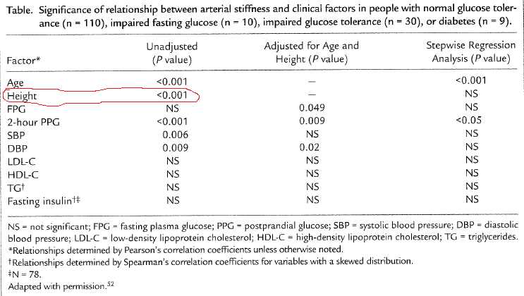
Take a look at the table below, which I blogged about in a previous post (). This table shows that there is a strong unadjusted correlation between height and arterial stiffness, a marker of heart disease. The likelihood that the correlation is due to chance is lower than one tenth of a percentage point (P<.001).
0>
Interestingly, the authors of the study even use height as a control variable to narrow down the “true” causes of arterial stiffness (column with adjusted results), assuming that height did indeed influence arterial stiffness and what they found to be a key predictor of arterial stiffness, 2-hour postprandial glucose.
But there is no convincing evidence that height causes heart disease, with exception of pathological extremes – e.g., acromegaly. Extremes tend to influence statistical results somewhat, leading to conflicting conclusions that end up being disseminated by the popular media (). This is one of the sources of popular beliefs about medical issues.
Another, more important, source are real confounders. And this takes us back to the issue of height being associated with heart disease. In fact, height will typically be significantly associated with heart disease in almost any study that includes men and women and does not control for biological sex.
One of the reasons is that women overall tend to have a significantly lower incident of heart disease than men. The other is that height is significantly lower among women than men, on average, even though there are several women who are taller than the average man.
The table above was from a study including both sexes. Therefore, the strong association between height and arterial stiffness is a “reflection” of the strong association between being male and increased arterial stiffness. If one were to add a variable coded as 0 for male and 1 for female, and use it in a multivariate analysis of predictor of arterial stiffness, together with height, the effect of height would probably “disappear”.
Biological sex is the control variable, the “confounder”, that the authors should have used to narrow down the “true” causes of arterial stiffness (second column in the table). In the absence of biological sex, controlling for height accomplished something similar, but in a “wobbly” way, leaving many readers scratching their heads in confusion.
Take a look at the table below, which I blogged about in a previous post (). This table shows that there is a strong unadjusted correlation between height and arterial stiffness, a marker of heart disease. The likelihood that the correlation is due to chance is lower than one tenth of a percentage point (P<.001).
0>
Interestingly, the authors of the study even use height as a control variable to narrow down the “true” causes of arterial stiffness (column with adjusted results), assuming that height did indeed influence arterial stiffness and what they found to be a key predictor of arterial stiffness, 2-hour postprandial glucose.
But there is no convincing evidence that height causes heart disease, with exception of pathological extremes – e.g., acromegaly. Extremes tend to influence statistical results somewhat, leading to conflicting conclusions that end up being disseminated by the popular media (). This is one of the sources of popular beliefs about medical issues.
Another, more important, source are real confounders. And this takes us back to the issue of height being associated with heart disease. In fact, height will typically be significantly associated with heart disease in almost any study that includes men and women and does not control for biological sex.
One of the reasons is that women overall tend to have a significantly lower incident of heart disease than men. The other is that height is significantly lower among women than men, on average, even though there are several women who are taller than the average man.
The table above was from a study including both sexes. Therefore, the strong association between height and arterial stiffness is a “reflection” of the strong association between being male and increased arterial stiffness. If one were to add a variable coded as 0 for male and 1 for female, and use it in a multivariate analysis of predictor of arterial stiffness, together with height, the effect of height would probably “disappear”.
Biological sex is the control variable, the “confounder”, that the authors should have used to narrow down the “true” causes of arterial stiffness (second column in the table). In the absence of biological sex, controlling for height accomplished something similar, but in a “wobbly” way, leaving many readers scratching their heads in confusion.
Senin, 02 April 2012
The 2012 Arch Intern Med red meat-mortality study: Eating 234 g/d of red meat could reduce mortality by 23 percent
As we have seen in an earlier post on the China Study data (), which explored relationships hinted at by Denise Minger’s previous and highly perceptive analysis (), one can use a multivariate analysis tool like WarpPLS () to explore relationships based on data reported by others. This is true even when the dataset available is fairly small.
So I entered the data reported in the most recent (published online in March 2012) study looking at the relationship between red meat consumption and mortality into WarpPLS to do some exploratory analyses. I discussed the study in my previous post; it was conducted by Pan et al. (Frank B. Hu is the senior author) and published in the prestigious Archives of Internal Medicine (). The data I used is from Table 1 of the article; it reports figures on several variables along 5 quintiles, based on separate analyses of two samples, called “Health Professionals” and “Nurses Health” samples. The Health Professionals sample comprised males; the Nurses Health sample, females.
Below is an interesting exploratory model, with results. It includes a number of hypotheses, represented by arrows, which seem to make sense. This is helpful, because a model incorporating hypotheses that make sense allows for easy identification of nonsense results, and thus rejection of the model or the data. (Refutability is one of the most important characteristics of good theoretical models.) Keep in mind that the sample size here is very small (N=10), as the authors of the study reported data along 5 quintiles for the Health Professionals sample, together with 5 quintiles for the Nurses Health sample. In a sense, this is somewhat helpful, because a small sample tends to be “unstable”, leading nonsense results and other signs of problems to show up easily – one example would be multivariate coefficients of association (the beta coefficients reported near the arrows) greater than 1 due to collinearity ().
So what does the model above tell us? It tells us that smoking (Smokng) is associated with reduced physical activity (PhysAct); beta = -0.92. It tells us that smoking (Smokng) is associated with reduced food intake (FoodInt); beta = -0.36. It tells us that physical activity (PhysAct) is associated with reduced incidence of diabetes (Diabetes); beta = -0.25. It tells us that increased food intake (FoodInt) is associated with increased incidence of diabetes (Diabetes); beta = 0.93. It tells us that increased food intake (FoodInt) is associated with increased red meat intake (RedMeat); beta = 0.60. It tells us that increased incidence of diabetes (Diabetes) is associated with increased mortality (Mort); beta = 0.61. It tells us that being female (SexM1F2) is associated with reduced mortality (Mort); beta = -0.67.
Some of these betas are a bit too high (e.g., 0.93), due to the level of collinearity caused by such a small sample. Due to being quite high, they are statistically significant even in a small sample. Betas greater than 0.20 tend to become statistically significant when the sample size is 100 or greater; so all of the coefficients above would be statistically significant with a larger sample size. What is the common denominator of all of the associations above? The common denominator is that all of them make sense, qualitatively speaking; there is not a single case where the sign is the opposite of what we would expect. There is one association that is shown on the graph and that is missing from my summary of associations above; and it also makes sense, at least to me. The model also tells us that increased red meat intake (RedMeat) is associated with reduced mortality (Mort); beta = -0.25. More technically, it tells us that, when we control for biological sex (SexM1F2) and incidence of diabetes (Diabetes), increased red meat intake (RedMeat) is associated with reduced mortality (Mort).
How do we roughly estimate this effect in terms of amounts of red meat consumed? The -0.25 means that, for each standard deviation in the amount of red meat consumed, there is a corresponding 0.25 standard deviation reduction of mortality. (This interpretation is possible because I used WarpPLS’ linear analysis algorithm; a nonlinear algorithm would lead to a more complex interpretation.) The standard deviation for red meat consumption is 0.897 servings. Each serving has about 84 g. And the highest number of servings in the dataset is 3.1 servings, or 260 g/d (calculated as: 3.1*84). To stay a bit shy of this extreme, let us consider a slightly lower intake amount, which is 3.1 standard deviations, or 234 g/d (calculated as: 3.1*0.897*84). Since the standard deviation for mortality is 0.3 percentage points, we can conclude that an extra 234 g of red meat per day is associated with a reduction in mortality of approximately 23 percent (calculated as: 3.1*0.25*0.3).
Let me repeat for emphasis: the data reported by the authors suggests that, when we control for biological sex and incidence of diabetes, an extra 234 g of red meat per day is associated with a reduction in mortality of approximately 23 percent. This is exactly the opposite, qualitatively speaking, of what was reported by the authors in the article. I should note that this is also a minute effect, like the effect reported by the authors. (The mortality rates in the article are expressed as percentages, with the lowest being around 1 percent. So this 23 percent is a percentage of a percentage.) If you were to compare a group of 100 people who ate little red meat with another group of the same size that ate 234 g more of red meat every day, over a period of more than 20 years, you would not find a single additional death in either group. If you were to compare matched groups of 1,000 individuals, you would find only 2 additional deaths among the folks who ate little red meat.
At the same time, we can also see that excessive food intake is associated with increased mortality via its effect on diabetes. The product beta coefficient for the mediated effect FoodInt --> Diabetes --> Mort is 0.57. This means that, for each standard deviation of food intake in grams, there is a corresponding 0.57 standard deviation increase in mortality, via an increase in the incidence of diabetes. This is very likely at levels of food consumption where significantly more calories are consumed than spent, ultimately leading to many people becoming obese. The standard deviation for food intake is 355 calories. The highest daily food intake quintile reported in the article is 2,396 calories, which happens to be associated with the highest mortality (and is probably an underestimation); the lowest is 1,202 (also probably underestimated).
So, in summary, the data suggests that, for the particular sample studied (made up of two subsamples): (a) red meat intake is protective in terms of overall mortality, through a direct effect; and (b) the deleterious effect of overeating on mortality is stronger than the protective effect of red meat intake. These conclusions are consistent with those of my previous post on the same study (). The difference is that the previous post suggested a possible moderating protective effect; this post suggests a possible direct protective effect. Both effects are small, as was the negative effect reported by the authors of the study. Neither is statistically significant, due to sample size limitations (secondary data from an article; N=10). And all of this is based on a study that categorized various types of processed meat as red meat, and that did not distinguish grass-fed from non-grass-fed meat.
By the way, in discussions of red meat intake’s effect on health, often iron overload is mentioned. What many people don’t seem to realize is that iron overload is caused primarily by hereditary haemochromatosis. Another cause is “blood doping” to improve athletic performance (). Hereditary haemochromatosis is a very rare genetic disorder; rare enough to be statistically “invisible” in any study that does not specifically target people with this disorder.
So I entered the data reported in the most recent (published online in March 2012) study looking at the relationship between red meat consumption and mortality into WarpPLS to do some exploratory analyses. I discussed the study in my previous post; it was conducted by Pan et al. (Frank B. Hu is the senior author) and published in the prestigious Archives of Internal Medicine (). The data I used is from Table 1 of the article; it reports figures on several variables along 5 quintiles, based on separate analyses of two samples, called “Health Professionals” and “Nurses Health” samples. The Health Professionals sample comprised males; the Nurses Health sample, females.
Below is an interesting exploratory model, with results. It includes a number of hypotheses, represented by arrows, which seem to make sense. This is helpful, because a model incorporating hypotheses that make sense allows for easy identification of nonsense results, and thus rejection of the model or the data. (Refutability is one of the most important characteristics of good theoretical models.) Keep in mind that the sample size here is very small (N=10), as the authors of the study reported data along 5 quintiles for the Health Professionals sample, together with 5 quintiles for the Nurses Health sample. In a sense, this is somewhat helpful, because a small sample tends to be “unstable”, leading nonsense results and other signs of problems to show up easily – one example would be multivariate coefficients of association (the beta coefficients reported near the arrows) greater than 1 due to collinearity ().
So what does the model above tell us? It tells us that smoking (Smokng) is associated with reduced physical activity (PhysAct); beta = -0.92. It tells us that smoking (Smokng) is associated with reduced food intake (FoodInt); beta = -0.36. It tells us that physical activity (PhysAct) is associated with reduced incidence of diabetes (Diabetes); beta = -0.25. It tells us that increased food intake (FoodInt) is associated with increased incidence of diabetes (Diabetes); beta = 0.93. It tells us that increased food intake (FoodInt) is associated with increased red meat intake (RedMeat); beta = 0.60. It tells us that increased incidence of diabetes (Diabetes) is associated with increased mortality (Mort); beta = 0.61. It tells us that being female (SexM1F2) is associated with reduced mortality (Mort); beta = -0.67.
Some of these betas are a bit too high (e.g., 0.93), due to the level of collinearity caused by such a small sample. Due to being quite high, they are statistically significant even in a small sample. Betas greater than 0.20 tend to become statistically significant when the sample size is 100 or greater; so all of the coefficients above would be statistically significant with a larger sample size. What is the common denominator of all of the associations above? The common denominator is that all of them make sense, qualitatively speaking; there is not a single case where the sign is the opposite of what we would expect. There is one association that is shown on the graph and that is missing from my summary of associations above; and it also makes sense, at least to me. The model also tells us that increased red meat intake (RedMeat) is associated with reduced mortality (Mort); beta = -0.25. More technically, it tells us that, when we control for biological sex (SexM1F2) and incidence of diabetes (Diabetes), increased red meat intake (RedMeat) is associated with reduced mortality (Mort).
How do we roughly estimate this effect in terms of amounts of red meat consumed? The -0.25 means that, for each standard deviation in the amount of red meat consumed, there is a corresponding 0.25 standard deviation reduction of mortality. (This interpretation is possible because I used WarpPLS’ linear analysis algorithm; a nonlinear algorithm would lead to a more complex interpretation.) The standard deviation for red meat consumption is 0.897 servings. Each serving has about 84 g. And the highest number of servings in the dataset is 3.1 servings, or 260 g/d (calculated as: 3.1*84). To stay a bit shy of this extreme, let us consider a slightly lower intake amount, which is 3.1 standard deviations, or 234 g/d (calculated as: 3.1*0.897*84). Since the standard deviation for mortality is 0.3 percentage points, we can conclude that an extra 234 g of red meat per day is associated with a reduction in mortality of approximately 23 percent (calculated as: 3.1*0.25*0.3).
Let me repeat for emphasis: the data reported by the authors suggests that, when we control for biological sex and incidence of diabetes, an extra 234 g of red meat per day is associated with a reduction in mortality of approximately 23 percent. This is exactly the opposite, qualitatively speaking, of what was reported by the authors in the article. I should note that this is also a minute effect, like the effect reported by the authors. (The mortality rates in the article are expressed as percentages, with the lowest being around 1 percent. So this 23 percent is a percentage of a percentage.) If you were to compare a group of 100 people who ate little red meat with another group of the same size that ate 234 g more of red meat every day, over a period of more than 20 years, you would not find a single additional death in either group. If you were to compare matched groups of 1,000 individuals, you would find only 2 additional deaths among the folks who ate little red meat.
At the same time, we can also see that excessive food intake is associated with increased mortality via its effect on diabetes. The product beta coefficient for the mediated effect FoodInt --> Diabetes --> Mort is 0.57. This means that, for each standard deviation of food intake in grams, there is a corresponding 0.57 standard deviation increase in mortality, via an increase in the incidence of diabetes. This is very likely at levels of food consumption where significantly more calories are consumed than spent, ultimately leading to many people becoming obese. The standard deviation for food intake is 355 calories. The highest daily food intake quintile reported in the article is 2,396 calories, which happens to be associated with the highest mortality (and is probably an underestimation); the lowest is 1,202 (also probably underestimated).
So, in summary, the data suggests that, for the particular sample studied (made up of two subsamples): (a) red meat intake is protective in terms of overall mortality, through a direct effect; and (b) the deleterious effect of overeating on mortality is stronger than the protective effect of red meat intake. These conclusions are consistent with those of my previous post on the same study (). The difference is that the previous post suggested a possible moderating protective effect; this post suggests a possible direct protective effect. Both effects are small, as was the negative effect reported by the authors of the study. Neither is statistically significant, due to sample size limitations (secondary data from an article; N=10). And all of this is based on a study that categorized various types of processed meat as red meat, and that did not distinguish grass-fed from non-grass-fed meat.
By the way, in discussions of red meat intake’s effect on health, often iron overload is mentioned. What many people don’t seem to realize is that iron overload is caused primarily by hereditary haemochromatosis. Another cause is “blood doping” to improve athletic performance (). Hereditary haemochromatosis is a very rare genetic disorder; rare enough to be statistically “invisible” in any study that does not specifically target people with this disorder.
Senin, 19 Maret 2012
The 2012 red meat-mortality study (Arch Intern Med): The data suggests that red meat is protective
I am not a big fan of using arguments such as “food questionnaires are unreliable” and “observational studies are worthless” to completely dismiss a study. There are many reasons for this. One of them is that, when people misreport certain diet and lifestyle patterns, but do that consistently (i.e., everybody underreports food intake), the biasing effect on coefficients of association is minor. Measurement errors may remain for this or other reasons, but regression methods (linear and nonlinear) assume the existence of such errors, and are designed to yield robust coefficients in their presence. Besides, for me to use these types of arguments would be hypocritical, since I myself have done several analyses on the China Study data (), and built what I think are valid arguments based on those analyses.
My approach is: Let us look at the data, any data, carefully, using appropriate analysis tools, and see what it tells us; maybe we will find evidence of measurement errors distorting the results and leading to mistaken conclusions, or maybe not. With this in mind, let us take a look at the top part of Table 3 of the most recent (published online in March 2012) study looking at the relationship between red meat consumption and mortality, authored by Pan et al. (Frank B. Hu is the senior author) and published in the prestigious Archives of Internal Medicine (). This is a prominent journal, with an average of over 270 citations per article according to Google Scholar. The study has received much media attention recently.
Take a look at the area highlighted in red, focusing on data from the Health Professionals sample. That is the multivariate-adjusted cardiovascular mortality rate, listed as a normalized percentage, in the highest quintile (Q5) of red meat consumption from the Health Professionals sample. The non-adjusted percentages are 1.4 percent mortality in Q5 and 1.13 in Q1 (from Table 1 of the same article); so the multivariate adjustment-normalization changed the values of the percentages somewhat, but not much. The highlighted 1.35 number suggests that for each group of 100 people who consumed a lot of red meat (Q5), when compared with a group of 100 people who consumed little red meat (Q1), there were on average 0.35 more deaths over the same period of time (more than 20 years).
The heavy red meat eaters in Q5 consumed 972.37 percent more red meat than those in Q1. This is calculated with data from Table 1 of the same article, as: (2.36-0.22)/0.22. In Q5, the 2.36 number refers to the number of servings of red meat per day, with each serving being approximately 84 g. So the heavy red meat eaters ate approximately 198 g per day (a bit less than 0.5 lb), while the light red meat eaters ate about 18 g per day. In other words, the heavy red meat eaters ate 9.7237 times more, or 972.37 percent more, red meat.
So, just to be clear, even though the folks in Q5 consumed 972.37 percent more red meat than the folks in Q1, in each matched group of 100 you would not find a single additional death over the same time period. If you looked at matched groups of 1,000 individuals, you would find 3 more deaths among the heavy red meat eaters. The same general pattern, of a minute difference, repeats itself throughout Table 3. As you can see, all of the reported mortality ratios are 1-point-something. In fact, this same pattern repeats itself in all mortality tables (all-cause, cardiovascular, cancer). This is all based on a multivariate analysis that according to the authors controlled for a large number of variables, including baseline history of diabetes.
Interestingly, looking at data from the same sample (Health Professionals), the incidence of diabetes is 75 percent higher in Q5 than in Q1. The same is true for the second sample (Nurses Health), where the Q5-Q1 difference in incidence of diabetes is even greater - 81 percent. This caught my eye, being diabetes such a prototypical “disease of affluence”. So I entered the whole data reported in the article into HCE () and WarpPLS (), and conducted some analyses. The graphs below are from HCE. The data includes both samples – Health Professionals and Nurses Health.
HCE calculates bivariate correlations, and so does WarpPLS. But WarpPLS stores numbers with a higher level of precision, so I used WarpPLS for calculating coefficients of association, including correlations. I also double-checked the numbers with other software, just in case (e.g., SPSS and MATLAB). Here are the correlations calculated by WarpPLS, which refer to the graphs above: 0.030 for red meat intake and mortality; 0.607 for diabetes and mortality; and 0.910 for food intake and diabetes. Yes, you read it right, the correlation between red meat intake and mortality is a very low and non-significant 0.030 in this dataset. Not a big surprise when you look at the related HCE graph, with the line going up and down almost at random. Note that I included the quintiles data from both the Health Professionals and Nurses Health samples in one dataset.
Those folks in Q5 had a much higher incidence of diabetes, and yet the increase in mortality for them was significantly lower, in percentage terms. A key difference between Q5 and Q1 being what? The Q5 folks ate a lot more red meat. This looks suspiciously suggestive of a finding that I came across before, based on an analysis of the China Study II data (). The finding was that animal food consumption (and red meat is an animal food) was protective, actually reducing the negative effect of wheat flour consumption on mortality. That analysis actually suggested that wheat flour consumption may not be so bad if you eat 221 g or more of animal food daily.
So, I built the model below in WarpPLS, where red meat intake (RedMeat) is hypothesized to moderate the relationship between diabetes incidence (Diabetes) and mortality (Mort). Below I am also including the graphs for the direct and moderating effects; the data is standardized, which reduces estimation error, particularly in moderating effects estimation. I used a standard linear algorithm for the calculation of the path coefficients (betas next to the arrows) and jackknifing for the calculation of the P values (confidence = 1 – P value). Jackknifing is a resampling technique that does not require multivariate normality and that tends to work well with small samples; as is the case with nonparametric techniques in general.
The direct effect of diabetes on mortality is positive (0.68) and almost statistically significant at the P < 0.05 level (confidence of 94 percent), which is noteworthy because the sample size here is so small – only 10 data points, 5 quintiles from the Health Professionals sample and 5 from the Nurses Health sample. The moderating effect is negative (-0.11), but not statistically significant (confidence of 61 percent). In the moderating effect graphs (shown side-by-side), this negative moderation is indicated by a slightly less steep inclination of the regression line for the graph on the right, which refers to high red meat intake. A less steep inclination means a less strong relationship between diabetes and mortality – among the folks who ate the most red meat.
Not too surprisingly, at least to me, the results above suggest that red meat per se may well be protective. Although we should consider a least two other possibilities. One is that red meat intake is a marker for consumption of some other things, possibly present in animal foods, that are protective - e.g., choline and vitamin K2. The other possibility is that red meat is protective in part by displacing other less healthy foods. Perhaps what we are seeing here is a combination of these.
Whatever the reason may be, red meat consumption seems to actually lessen the effect of diabetes on mortality in this sample. That is, according to this data, the more red meat is consumed, the fewer people die from diabetes. The protective effect might have been stronger if the participants had eaten more red meat, or more animal foods containing the protective factors; recall that the threshold for protection in the China Study II data was consumption of 221 g or more of animal food daily (). Having said that, it is also important to note that, if you eat excess calories to the point of becoming obese, from red meat or any other sources, your risk of developing diabetes will go up – as the earlier HCE graph relating food intake and diabetes implies.
Please keep in mind that this post is the result of a quick analysis of secondary data reported in a journal article, and its conclusions may be wrong, even though I did my best not to make any mistake (e.g., mistyping data from the article). The authors likely spent months, if not more, in their study; and have the support of one of the premier research universities in the world. Still, this post raises serious questions. I say this respectfully, as the authors did seem to try their best to control for all possible confounders.
I should also say that the moderating effect I uncovered is admittedly a fairly weak effect on this small sample and not statistically significant. But its magnitude is apparently greater than the reported effects of red meat on mortality, which are not only minute but may well be statistical artifacts. The Cox proportional hazards analysis employed in the study, which is commonly used in epidemiology, is nothing more than a sophisticated ANCOVA; it is a semi-parametric version of a special case of the broader analysis method automated by WarpPLS.
Finally, I could not control for confounders because, given the small sample, inclusion of confounders (e.g., smoking) leads to massive collinearity. WarpPLS calculates collinearity estimates automatically, and is particularly thorough at doing that (calculating them at multiple levels), so there is no way to ignore them. Collinearity can severely distort results, as pointed out in a YouTube video on WarpPLS (). Collinearity can even lead to changes in the signs of coefficients of association, in the context of multivariate analyses - e.g., a positive association appears to be negative. The authors have the original data – a much, much larger sample - which makes it much easier to deal with collinearity.
Moderating effects analyses () – we need more of that in epidemiological research eh?
My approach is: Let us look at the data, any data, carefully, using appropriate analysis tools, and see what it tells us; maybe we will find evidence of measurement errors distorting the results and leading to mistaken conclusions, or maybe not. With this in mind, let us take a look at the top part of Table 3 of the most recent (published online in March 2012) study looking at the relationship between red meat consumption and mortality, authored by Pan et al. (Frank B. Hu is the senior author) and published in the prestigious Archives of Internal Medicine (). This is a prominent journal, with an average of over 270 citations per article according to Google Scholar. The study has received much media attention recently.
Take a look at the area highlighted in red, focusing on data from the Health Professionals sample. That is the multivariate-adjusted cardiovascular mortality rate, listed as a normalized percentage, in the highest quintile (Q5) of red meat consumption from the Health Professionals sample. The non-adjusted percentages are 1.4 percent mortality in Q5 and 1.13 in Q1 (from Table 1 of the same article); so the multivariate adjustment-normalization changed the values of the percentages somewhat, but not much. The highlighted 1.35 number suggests that for each group of 100 people who consumed a lot of red meat (Q5), when compared with a group of 100 people who consumed little red meat (Q1), there were on average 0.35 more deaths over the same period of time (more than 20 years).
The heavy red meat eaters in Q5 consumed 972.37 percent more red meat than those in Q1. This is calculated with data from Table 1 of the same article, as: (2.36-0.22)/0.22. In Q5, the 2.36 number refers to the number of servings of red meat per day, with each serving being approximately 84 g. So the heavy red meat eaters ate approximately 198 g per day (a bit less than 0.5 lb), while the light red meat eaters ate about 18 g per day. In other words, the heavy red meat eaters ate 9.7237 times more, or 972.37 percent more, red meat.
So, just to be clear, even though the folks in Q5 consumed 972.37 percent more red meat than the folks in Q1, in each matched group of 100 you would not find a single additional death over the same time period. If you looked at matched groups of 1,000 individuals, you would find 3 more deaths among the heavy red meat eaters. The same general pattern, of a minute difference, repeats itself throughout Table 3. As you can see, all of the reported mortality ratios are 1-point-something. In fact, this same pattern repeats itself in all mortality tables (all-cause, cardiovascular, cancer). This is all based on a multivariate analysis that according to the authors controlled for a large number of variables, including baseline history of diabetes.
Interestingly, looking at data from the same sample (Health Professionals), the incidence of diabetes is 75 percent higher in Q5 than in Q1. The same is true for the second sample (Nurses Health), where the Q5-Q1 difference in incidence of diabetes is even greater - 81 percent. This caught my eye, being diabetes such a prototypical “disease of affluence”. So I entered the whole data reported in the article into HCE () and WarpPLS (), and conducted some analyses. The graphs below are from HCE. The data includes both samples – Health Professionals and Nurses Health.
HCE calculates bivariate correlations, and so does WarpPLS. But WarpPLS stores numbers with a higher level of precision, so I used WarpPLS for calculating coefficients of association, including correlations. I also double-checked the numbers with other software, just in case (e.g., SPSS and MATLAB). Here are the correlations calculated by WarpPLS, which refer to the graphs above: 0.030 for red meat intake and mortality; 0.607 for diabetes and mortality; and 0.910 for food intake and diabetes. Yes, you read it right, the correlation between red meat intake and mortality is a very low and non-significant 0.030 in this dataset. Not a big surprise when you look at the related HCE graph, with the line going up and down almost at random. Note that I included the quintiles data from both the Health Professionals and Nurses Health samples in one dataset.
Those folks in Q5 had a much higher incidence of diabetes, and yet the increase in mortality for them was significantly lower, in percentage terms. A key difference between Q5 and Q1 being what? The Q5 folks ate a lot more red meat. This looks suspiciously suggestive of a finding that I came across before, based on an analysis of the China Study II data (). The finding was that animal food consumption (and red meat is an animal food) was protective, actually reducing the negative effect of wheat flour consumption on mortality. That analysis actually suggested that wheat flour consumption may not be so bad if you eat 221 g or more of animal food daily.
So, I built the model below in WarpPLS, where red meat intake (RedMeat) is hypothesized to moderate the relationship between diabetes incidence (Diabetes) and mortality (Mort). Below I am also including the graphs for the direct and moderating effects; the data is standardized, which reduces estimation error, particularly in moderating effects estimation. I used a standard linear algorithm for the calculation of the path coefficients (betas next to the arrows) and jackknifing for the calculation of the P values (confidence = 1 – P value). Jackknifing is a resampling technique that does not require multivariate normality and that tends to work well with small samples; as is the case with nonparametric techniques in general.
The direct effect of diabetes on mortality is positive (0.68) and almost statistically significant at the P < 0.05 level (confidence of 94 percent), which is noteworthy because the sample size here is so small – only 10 data points, 5 quintiles from the Health Professionals sample and 5 from the Nurses Health sample. The moderating effect is negative (-0.11), but not statistically significant (confidence of 61 percent). In the moderating effect graphs (shown side-by-side), this negative moderation is indicated by a slightly less steep inclination of the regression line for the graph on the right, which refers to high red meat intake. A less steep inclination means a less strong relationship between diabetes and mortality – among the folks who ate the most red meat.
Not too surprisingly, at least to me, the results above suggest that red meat per se may well be protective. Although we should consider a least two other possibilities. One is that red meat intake is a marker for consumption of some other things, possibly present in animal foods, that are protective - e.g., choline and vitamin K2. The other possibility is that red meat is protective in part by displacing other less healthy foods. Perhaps what we are seeing here is a combination of these.
Whatever the reason may be, red meat consumption seems to actually lessen the effect of diabetes on mortality in this sample. That is, according to this data, the more red meat is consumed, the fewer people die from diabetes. The protective effect might have been stronger if the participants had eaten more red meat, or more animal foods containing the protective factors; recall that the threshold for protection in the China Study II data was consumption of 221 g or more of animal food daily (). Having said that, it is also important to note that, if you eat excess calories to the point of becoming obese, from red meat or any other sources, your risk of developing diabetes will go up – as the earlier HCE graph relating food intake and diabetes implies.
Please keep in mind that this post is the result of a quick analysis of secondary data reported in a journal article, and its conclusions may be wrong, even though I did my best not to make any mistake (e.g., mistyping data from the article). The authors likely spent months, if not more, in their study; and have the support of one of the premier research universities in the world. Still, this post raises serious questions. I say this respectfully, as the authors did seem to try their best to control for all possible confounders.
I should also say that the moderating effect I uncovered is admittedly a fairly weak effect on this small sample and not statistically significant. But its magnitude is apparently greater than the reported effects of red meat on mortality, which are not only minute but may well be statistical artifacts. The Cox proportional hazards analysis employed in the study, which is commonly used in epidemiology, is nothing more than a sophisticated ANCOVA; it is a semi-parametric version of a special case of the broader analysis method automated by WarpPLS.
Finally, I could not control for confounders because, given the small sample, inclusion of confounders (e.g., smoking) leads to massive collinearity. WarpPLS calculates collinearity estimates automatically, and is particularly thorough at doing that (calculating them at multiple levels), so there is no way to ignore them. Collinearity can severely distort results, as pointed out in a YouTube video on WarpPLS (). Collinearity can even lead to changes in the signs of coefficients of association, in the context of multivariate analyses - e.g., a positive association appears to be negative. The authors have the original data – a much, much larger sample - which makes it much easier to deal with collinearity.
Moderating effects analyses () – we need more of that in epidemiological research eh?
Senin, 17 Oktober 2011
Book review: Perfect Health Diet
Perfect Health Diet is a book that one should own. It is not the type of book that you can get from your local library and just do a quick read over (and, maybe, write a review about it). If you do that, you will probably miss several important ideas that form the foundation of this book, which is a deep foundation.
The book is titled “Perfect Health Diet”, not “The Perfect Health Diet”. If you think that this is a mistake, consider that the most successful social networking web site of all time started as “The Facebook”, and then changed to simply “Facebook”; which was perceived later as a major improvement.
Moreover, “Perfect Health Diet” makes for a cool and not at all inappropriate acronym – “PHD”.
What people eat has an enormous influence on their lives, and also on the lives of those around them. Nutrition is clearly one of the most important topics in the modern world - it is the source of much happiness and suffering for entire populations. If Albert Einstein and Marie Curie were alive today, they would probably be interested in nutrition, as they were about important topics of their time that were outside their main disciplines and research areas (e.g., the consequences of war, and future war deterrence).
Nutrition attracts the interest of many bright people today. Those who are not professional nutrition researchers often fund their own research, spending hours and hours of their own time studying the literature and even experimenting on themselves. Several of them decide to think deeply and carefully about it. A few, like Paul Jaminet and Shou-Ching Jaminet, decide to write about it, and all of us benefit from their effort.
The Jaminets have PhDs (not copies of their books, degrees). Their main PhD disciplines are somewhat similar to Einstein’s and Curie’s; which is an interesting coincidence. What the Jaminets have written about nutrition is probably analogous, in broad terms, to what Einstein and Curie would have written about nutrition if they were alive today. They would have written about a “unified field theory” of nutrition, informed by chemistry.
To put it simply, the main idea behind this book is to find the “sweet spot” for each major macronutrient (e.g., protein and fat) and micronutrient (e.g., vitamins and minerals) that is important for humans. The sweet spot is the area indicated on the graph below. This is my own simplified interpretation of the authors' more complex graphs on marginal benefits from nutrients.
The book provides detailed information about each of the major nutrients that are important to humans, what their “sweet spot” levels are, and how to obtain them. In this respect the book is very thorough, and also very clear, including plenty of good arguments and empirical research results to back up the recommendations. But this book is much more than that.
Why do I refer to this book as proposing a “unified field theory” of nutrition? The reason is that this book clearly aims at unifying all of the current state of the art knowledge about nutrition, departing from a few fundamental ideas.
One of those fundamental ideas is that a good diet would provide nutrients in the same ratio as those provided by our own tissues when we “cannibalize” them – i.e., when we fast. Another is that human breast milk is a good basis for the estimation of the ratios of macronutrients a human adult would need for optimal health.
And here is where the depth and brilliance with which the authors address these issues can lead to misunderstandings.
For example, when our body “cannibalizes” itself (e.g., at the 16-h mark of a water fast), there is no digestion going on. And, as the authors point out, what you eat, in terms of nutrients, is often not what you get after digestion. It may surprise many to know that a diet rich in vegetables is actually a high fat diet (if you are surprised, you should read the book). One needs to keep these things in mind to understand that not all dietary macronutrient ratios will lead to the same ratios of nutrients after digestion, and that the dietary equivalent of “cannibalizing” oneself is not a beef-only diet.
Another example relates to the issue of human breast milk. Many seem to have misunderstood the authors as implying that the macronutrient ratios in human breast milk are optimal for adult humans. The authors say nothing of the kind. What they do is to use human breast milk as a basis for their estimation of what an adult human should get, based on a few reasonable assumptions. One of the assumptions is that a human adult’s brain consumes proportionally much less sugar than an infant’s.
Yet another example is the idea of “safe starches”, which many seem to have taken as a recommendation that diabetics should eat lots of white rice and potato. The authors have never said such a thing in the book; not even close. "Safe starches", like white rice and sweet potatoes (as well as white potatoes), are presented in the book as good sources of carbohydrates that are also generally free from harmful plant toxins. And they are, if consumed after cooking.
By the way, I have a colleague who has type 2 diabetes and can eat meat with white potatoes without experiencing hyperglycemia, as long as the amount of potato is very small and is eaten after a few bites of meat.
Do I disagree with some of the things that the authors say? Sure I do, but not in a way that would lead to significantly different dietary recommendations. And, who knows, maybe I am wrong.
For example, the authors seem to think that dietary advanced glycation end-products (AGEs) can be a problem for humans, and therefore recommend that you avoid cooking meat at high temperatures (no barbecuing, for example). I have not found any convincing evidence that this is true in healthy people, but following the authors’ advice will not hurt you at all. And if your digestive tract is compromised to the point that undigested food particles are entering your bloodstream, then maybe you should avoid dietary sources of AGEs.
Also, I think that humans tend to adapt to different macronutrient ratios in more fundamental ways than the authors seem to believe they can. These adaptations are long-term ones, and are better understood based on the notion of compensatory adaptation. For instance, a very low carbohydrate diet may bring about some problems in the short term, but long-term adaptations may reverse those problems, without a change in the diet.
The authors should be careful about small errors that may give a bad impression to some experts, and open them up to undue criticism; as experts tend to be very picky and frequently generalize based on small errors. Here is one. The authors seem to imply that eating coconut oil will help feed colon cells, which indeed seem to feed on short-chain fats; not exactly the medium-chain fats abundantly found in coconut oil, but okay. (This may be the main reason why indigestible fiber contributes to colon health, by being converted by bacteria to short-chain fats.) The main problem with the authors' implied claim is that coconut oil, as a fat, will be absorbed in the small intestine, and thus will not reach colon cells in any significant amounts.
Finally, I don’t think that increased animal protein consumption causes decreased longevity; an idea that the authors seem to lean toward. One reason is that seafood consumption is almost universally associated with increased longevity, even when it is heavily consumed, and seafood in general has a very high protein-to-fat ratio (much higher than beef). The connection between high animal protein consumption and decreased longevity suggested by many studies, some of which are cited in the book, is unlikely to be due to the protein itself, in my opinion. That connection is more likely to be due to some patterns that may be associated in certain populations with animal protein consumption (e.g., refined wheat and industrial seed oils consumption).
Thankfully, controversial issues and small errors can be easily addressed online. The authors maintain a popular blog, and they do so in such a way that the blog is truly an extension of the book. This blog is one of my favorites. Perhaps we will see some of the above issues addressed in the blog.
All in all, this seems like a bargain to me. For about 25 bucks (less than that, if you trade in quid; and more, if you do in Yuan), and with some self-determination, you may save thousands of dollars in medical bills. More importantly, you may change your life, and those of the ones around you, for the better.
The book is titled “Perfect Health Diet”, not “The Perfect Health Diet”. If you think that this is a mistake, consider that the most successful social networking web site of all time started as “The Facebook”, and then changed to simply “Facebook”; which was perceived later as a major improvement.
Moreover, “Perfect Health Diet” makes for a cool and not at all inappropriate acronym – “PHD”.
What people eat has an enormous influence on their lives, and also on the lives of those around them. Nutrition is clearly one of the most important topics in the modern world - it is the source of much happiness and suffering for entire populations. If Albert Einstein and Marie Curie were alive today, they would probably be interested in nutrition, as they were about important topics of their time that were outside their main disciplines and research areas (e.g., the consequences of war, and future war deterrence).
Nutrition attracts the interest of many bright people today. Those who are not professional nutrition researchers often fund their own research, spending hours and hours of their own time studying the literature and even experimenting on themselves. Several of them decide to think deeply and carefully about it. A few, like Paul Jaminet and Shou-Ching Jaminet, decide to write about it, and all of us benefit from their effort.
The Jaminets have PhDs (not copies of their books, degrees). Their main PhD disciplines are somewhat similar to Einstein’s and Curie’s; which is an interesting coincidence. What the Jaminets have written about nutrition is probably analogous, in broad terms, to what Einstein and Curie would have written about nutrition if they were alive today. They would have written about a “unified field theory” of nutrition, informed by chemistry.
To put it simply, the main idea behind this book is to find the “sweet spot” for each major macronutrient (e.g., protein and fat) and micronutrient (e.g., vitamins and minerals) that is important for humans. The sweet spot is the area indicated on the graph below. This is my own simplified interpretation of the authors' more complex graphs on marginal benefits from nutrients.
The book provides detailed information about each of the major nutrients that are important to humans, what their “sweet spot” levels are, and how to obtain them. In this respect the book is very thorough, and also very clear, including plenty of good arguments and empirical research results to back up the recommendations. But this book is much more than that.
Why do I refer to this book as proposing a “unified field theory” of nutrition? The reason is that this book clearly aims at unifying all of the current state of the art knowledge about nutrition, departing from a few fundamental ideas.
One of those fundamental ideas is that a good diet would provide nutrients in the same ratio as those provided by our own tissues when we “cannibalize” them – i.e., when we fast. Another is that human breast milk is a good basis for the estimation of the ratios of macronutrients a human adult would need for optimal health.
And here is where the depth and brilliance with which the authors address these issues can lead to misunderstandings.
For example, when our body “cannibalizes” itself (e.g., at the 16-h mark of a water fast), there is no digestion going on. And, as the authors point out, what you eat, in terms of nutrients, is often not what you get after digestion. It may surprise many to know that a diet rich in vegetables is actually a high fat diet (if you are surprised, you should read the book). One needs to keep these things in mind to understand that not all dietary macronutrient ratios will lead to the same ratios of nutrients after digestion, and that the dietary equivalent of “cannibalizing” oneself is not a beef-only diet.
Another example relates to the issue of human breast milk. Many seem to have misunderstood the authors as implying that the macronutrient ratios in human breast milk are optimal for adult humans. The authors say nothing of the kind. What they do is to use human breast milk as a basis for their estimation of what an adult human should get, based on a few reasonable assumptions. One of the assumptions is that a human adult’s brain consumes proportionally much less sugar than an infant’s.
Yet another example is the idea of “safe starches”, which many seem to have taken as a recommendation that diabetics should eat lots of white rice and potato. The authors have never said such a thing in the book; not even close. "Safe starches", like white rice and sweet potatoes (as well as white potatoes), are presented in the book as good sources of carbohydrates that are also generally free from harmful plant toxins. And they are, if consumed after cooking.
By the way, I have a colleague who has type 2 diabetes and can eat meat with white potatoes without experiencing hyperglycemia, as long as the amount of potato is very small and is eaten after a few bites of meat.
Do I disagree with some of the things that the authors say? Sure I do, but not in a way that would lead to significantly different dietary recommendations. And, who knows, maybe I am wrong.
For example, the authors seem to think that dietary advanced glycation end-products (AGEs) can be a problem for humans, and therefore recommend that you avoid cooking meat at high temperatures (no barbecuing, for example). I have not found any convincing evidence that this is true in healthy people, but following the authors’ advice will not hurt you at all. And if your digestive tract is compromised to the point that undigested food particles are entering your bloodstream, then maybe you should avoid dietary sources of AGEs.
Also, I think that humans tend to adapt to different macronutrient ratios in more fundamental ways than the authors seem to believe they can. These adaptations are long-term ones, and are better understood based on the notion of compensatory adaptation. For instance, a very low carbohydrate diet may bring about some problems in the short term, but long-term adaptations may reverse those problems, without a change in the diet.
The authors should be careful about small errors that may give a bad impression to some experts, and open them up to undue criticism; as experts tend to be very picky and frequently generalize based on small errors. Here is one. The authors seem to imply that eating coconut oil will help feed colon cells, which indeed seem to feed on short-chain fats; not exactly the medium-chain fats abundantly found in coconut oil, but okay. (This may be the main reason why indigestible fiber contributes to colon health, by being converted by bacteria to short-chain fats.) The main problem with the authors' implied claim is that coconut oil, as a fat, will be absorbed in the small intestine, and thus will not reach colon cells in any significant amounts.
Finally, I don’t think that increased animal protein consumption causes decreased longevity; an idea that the authors seem to lean toward. One reason is that seafood consumption is almost universally associated with increased longevity, even when it is heavily consumed, and seafood in general has a very high protein-to-fat ratio (much higher than beef). The connection between high animal protein consumption and decreased longevity suggested by many studies, some of which are cited in the book, is unlikely to be due to the protein itself, in my opinion. That connection is more likely to be due to some patterns that may be associated in certain populations with animal protein consumption (e.g., refined wheat and industrial seed oils consumption).
Thankfully, controversial issues and small errors can be easily addressed online. The authors maintain a popular blog, and they do so in such a way that the blog is truly an extension of the book. This blog is one of my favorites. Perhaps we will see some of the above issues addressed in the blog.
All in all, this seems like a bargain to me. For about 25 bucks (less than that, if you trade in quid; and more, if you do in Yuan), and with some self-determination, you may save thousands of dollars in medical bills. More importantly, you may change your life, and those of the ones around you, for the better.
Senin, 19 September 2011
Being glucose intolerant may make you live only to be 96, if you would otherwise live to be 100
This comes also from the widely cited Brunner and colleagues study, published in Diabetes Care in 2006. They defined a person as glucose intolerant if he or she had a blood glucose level of 5.3-11 mmol/l after a 2-h post–50-g oral glucose tolerance test. For those using the other measurement system, like us here in the USA, that is a blood glucose level of approximately 95-198 mg/dl.
Quite a range, eh!? This covers the high end of normoglycemia, as well as pre- to full-blown type 2 diabetes.
In this investigation, called the Whitehall Study, 18,403 nonindustrial London-based male civil servants aged 40 to 64 years were examined between September 1967 and January 1970. These folks were then followed for over 30 years, based on the National Health Service Central Registry; essentially to find out whether they had died, and of what. During this period, there were 11,426 deaths from all causes; with 5,497 due to cardiovascular disease (48.1%) and 3,240 due to cancer (28.4%).
The graph below shows the age-adjusted survival rates against time after diagnosis. Presumably the N values refer to the individuals in the glucose intolerant (GI) and type 2 diabetic (T2DM) groups that were alive at the end of the monitoring period. This does not apply to the normoglycemic N value; this value seems to refer to the number of normoglycemic folks alive after the divergence point (5-10 years from diagnosis).
Note by the authors: “Survival by baseline glucose tolerance status diverged after 5-10 years of follow-up. Median survival differed by 4 years between the normoglycemic and glucose intolerant groups and was 10 years less in the diabetic compared with the glucose intolerant group.”
That is, it took between 5 and 10 years of high blood glucose levels for any effect on mortality to be noticed. One would expect at least some of the diagnosed folks to have done something about their blood glucose levels; a confounder that was not properly controlled for in this study, as far as I can tell. The glucose intolerant folks ended up living 4 years less than the normoglycemics, and 10 years more than the diabetics.
One implication of this article is that perhaps you should not worry too much if you experience a temporary increase in blood glucose levels due to compensatory adaptation to healthy changes in diet and lifestyle, such as elevated growth hormone levels. It seems unlikely that such temporary increase in blood glucose levels, even if lasting as much as 1 year, will lead to permanent damage to cells involved in glucose metabolism like the beta cells in the pancreas.
Another implication is that being diagnosed as pre-diabetic or diabetic is not a death sentence, as some people seem to take such diagnoses at first. Many of the folks in this study who decided to do something about their health following an adverse diagnosis probably followed the traditional advice for the treatment of pre-diabetes and diabetes, which likely made their health worse. (See Jeff O’Connell’s book Sugar Nation for a detailed discussion of what that advice entails.) And still, not everyone progressed from pre-diabetes to full-blow diabetes. Probably fewer refined foods available helped, but this does not fully explain the lack of progression to full-blow diabetes.
It is important to note that this study was conducted in the late 1960s. Biosynthetic insulin was developed in the 1970s using recombinant DNA techniques, and was thus largely unavailable to the participants of this study. Other treatment options were also largely unavailable. Arguably the most influential book on low carbohydrate dieting, by Dr. Atkins, was published in the early 1970s. The targeted use of low carbohydrate dieting for blood glucose control in diabetics was not widely promoted until the 1980s, and even today it is not adopted by mainstream diabetes doctors. To this I should add that, at least anecdotally and from living in an area where diabetes is an epidemic (South Texas), those people who carefully control their blood sugars after type 2 diabetes diagnoses, in many cases with the help of drugs, seem to see marked and sustained health improvements.
Finally, an interesting implication of this study is that glucose intolerance, as defined in the article, would probably not do much to change an outside observer’s perception of a long-living population. That is, if you take a population whose individuals are predisposed to live long lives, with many naturally becoming centenarians, they will likely still be living long lives even if glucose intolerance is rampant. Without carefully conducted glucose tolerance tests, an outside observer may conclude that a damaging diet is actually healthy by still finding many long-living individuals in a population consuming that diet.
Quite a range, eh!? This covers the high end of normoglycemia, as well as pre- to full-blown type 2 diabetes.
In this investigation, called the Whitehall Study, 18,403 nonindustrial London-based male civil servants aged 40 to 64 years were examined between September 1967 and January 1970. These folks were then followed for over 30 years, based on the National Health Service Central Registry; essentially to find out whether they had died, and of what. During this period, there were 11,426 deaths from all causes; with 5,497 due to cardiovascular disease (48.1%) and 3,240 due to cancer (28.4%).
The graph below shows the age-adjusted survival rates against time after diagnosis. Presumably the N values refer to the individuals in the glucose intolerant (GI) and type 2 diabetic (T2DM) groups that were alive at the end of the monitoring period. This does not apply to the normoglycemic N value; this value seems to refer to the number of normoglycemic folks alive after the divergence point (5-10 years from diagnosis).
Note by the authors: “Survival by baseline glucose tolerance status diverged after 5-10 years of follow-up. Median survival differed by 4 years between the normoglycemic and glucose intolerant groups and was 10 years less in the diabetic compared with the glucose intolerant group.”
That is, it took between 5 and 10 years of high blood glucose levels for any effect on mortality to be noticed. One would expect at least some of the diagnosed folks to have done something about their blood glucose levels; a confounder that was not properly controlled for in this study, as far as I can tell. The glucose intolerant folks ended up living 4 years less than the normoglycemics, and 10 years more than the diabetics.
One implication of this article is that perhaps you should not worry too much if you experience a temporary increase in blood glucose levels due to compensatory adaptation to healthy changes in diet and lifestyle, such as elevated growth hormone levels. It seems unlikely that such temporary increase in blood glucose levels, even if lasting as much as 1 year, will lead to permanent damage to cells involved in glucose metabolism like the beta cells in the pancreas.
Another implication is that being diagnosed as pre-diabetic or diabetic is not a death sentence, as some people seem to take such diagnoses at first. Many of the folks in this study who decided to do something about their health following an adverse diagnosis probably followed the traditional advice for the treatment of pre-diabetes and diabetes, which likely made their health worse. (See Jeff O’Connell’s book Sugar Nation for a detailed discussion of what that advice entails.) And still, not everyone progressed from pre-diabetes to full-blow diabetes. Probably fewer refined foods available helped, but this does not fully explain the lack of progression to full-blow diabetes.
It is important to note that this study was conducted in the late 1960s. Biosynthetic insulin was developed in the 1970s using recombinant DNA techniques, and was thus largely unavailable to the participants of this study. Other treatment options were also largely unavailable. Arguably the most influential book on low carbohydrate dieting, by Dr. Atkins, was published in the early 1970s. The targeted use of low carbohydrate dieting for blood glucose control in diabetics was not widely promoted until the 1980s, and even today it is not adopted by mainstream diabetes doctors. To this I should add that, at least anecdotally and from living in an area where diabetes is an epidemic (South Texas), those people who carefully control their blood sugars after type 2 diabetes diagnoses, in many cases with the help of drugs, seem to see marked and sustained health improvements.
Finally, an interesting implication of this study is that glucose intolerance, as defined in the article, would probably not do much to change an outside observer’s perception of a long-living population. That is, if you take a population whose individuals are predisposed to live long lives, with many naturally becoming centenarians, they will likely still be living long lives even if glucose intolerance is rampant. Without carefully conducted glucose tolerance tests, an outside observer may conclude that a damaging diet is actually healthy by still finding many long-living individuals in a population consuming that diet.
Senin, 12 September 2011
Fasting blood glucose of 83 mg/dl and heart disease: Fact and fiction
If you are interested in the connection between blood glucose control and heart disease, you have probably done your homework. This is a scary connection, and sometimes the information on the Internetz make people even more scared. You have probably seen something to this effect mentioned:
So I decided to take a look at the Brunner and colleagues study. It covers, among other things, the relationship between cardiovascular disease (they use the acronym CHD for this), and 2-hour blood glucose levels after a 50-g oral glucose tolerance test (OGTT). They tested thousands of men at one point in time, and then followed them for over 30 years, which is really impressive. The graph below shows the relationship between CHD and blood glucose in mmol/l. Here is a calculator to convert the values to mg/dl.
The authors note in the limitations section that: “Fasting glucose was not measured.” So these results have nothing to do with fasting glucose, as we are led to believe when we see this study cited on the web. Also, on the abstract, the authors say that there is “no evidence of nonlinearity”, but in the results section they say that the data provides “evidence of a nonlinear relationship”. The relationship sure looks nonlinear to me. I tried to approximate it manually below.
Note that CHD mortality really goes up more clearly after a glucose level of 5.5 mmol/l (100 mg/dl). But it also varies significantly more widely after that level; the magnitudes of the error bars reflect that. Also, you can see that at around 6.7 mmol/l (121 mg/dl), CHD mortality is on average about the same as at 5.5 mmol/l (100 mg/dl) and 3.5 mmol/l (63 mg/dl). This last level suggests an abnormally high insulin response, bringing blood glucose levels down too much at the 2-hour mark – i.e., reactive hypoglycemia, which the study completely ignores.
These findings are consistent with the somewhat chaotic nature of blood glucose variations in normoglycemic individuals, and also with evidence suggesting that average blood glucose levels go up with age in a J-curve fashion even in long-lived individuals.
We also know that traits vary along a bell curve for any population of individuals. Research results are often reported as averages, but the average individual does not exist. The average individual is an abstraction, and you are not it. Glucose metabolism is a complex trait, which is influenced by many factors. This is why there is so much variation in mortality for different glucose levels, as indicated by the magnitudes of the error bars.
In any event, these findings are clearly inconsistent with the statement that "heart disease risk increases in a linear fashion as fasting blood glucose rises beyond 83 mg/dl". The authors even state early in the article that another study based on the same dataset, to which theirs was a follow-up, suggested that:
Many of the complications from diabetes, including heart disease, stem from poor glucose control. But it seems increasingly clear that blood glucose control does not have to be perfect to keep those complications at bay. For most people, blood glucose levels can be maintained within a certain range with the proper diet and lifestyle. You may be looking at a long life if you catch the problem early, even if your blood glucose is not always at 83 mg/dl (4.6 mmol/l). More on this on my next post.
Heart disease risk increases in a linear fashion as fasting blood glucose rises beyond 83 mg/dl.In fact, I have seen this many times, including on some very respectable blogs. I suspect it started with one blogger, and then got repeated over and over again by others; sometimes things become “true” through repetition. Frequently the reference cited is a study by Brunner and colleagues, published in Diabetes Care in 2006. I doubt very much the bloggers in question actually read this article. Sometimes a study by Coutinho and colleagues is also cited, but this latter study is actually a meta-analysis.
So I decided to take a look at the Brunner and colleagues study. It covers, among other things, the relationship between cardiovascular disease (they use the acronym CHD for this), and 2-hour blood glucose levels after a 50-g oral glucose tolerance test (OGTT). They tested thousands of men at one point in time, and then followed them for over 30 years, which is really impressive. The graph below shows the relationship between CHD and blood glucose in mmol/l. Here is a calculator to convert the values to mg/dl.
The authors note in the limitations section that: “Fasting glucose was not measured.” So these results have nothing to do with fasting glucose, as we are led to believe when we see this study cited on the web. Also, on the abstract, the authors say that there is “no evidence of nonlinearity”, but in the results section they say that the data provides “evidence of a nonlinear relationship”. The relationship sure looks nonlinear to me. I tried to approximate it manually below.
Note that CHD mortality really goes up more clearly after a glucose level of 5.5 mmol/l (100 mg/dl). But it also varies significantly more widely after that level; the magnitudes of the error bars reflect that. Also, you can see that at around 6.7 mmol/l (121 mg/dl), CHD mortality is on average about the same as at 5.5 mmol/l (100 mg/dl) and 3.5 mmol/l (63 mg/dl). This last level suggests an abnormally high insulin response, bringing blood glucose levels down too much at the 2-hour mark – i.e., reactive hypoglycemia, which the study completely ignores.
These findings are consistent with the somewhat chaotic nature of blood glucose variations in normoglycemic individuals, and also with evidence suggesting that average blood glucose levels go up with age in a J-curve fashion even in long-lived individuals.
We also know that traits vary along a bell curve for any population of individuals. Research results are often reported as averages, but the average individual does not exist. The average individual is an abstraction, and you are not it. Glucose metabolism is a complex trait, which is influenced by many factors. This is why there is so much variation in mortality for different glucose levels, as indicated by the magnitudes of the error bars.
In any event, these findings are clearly inconsistent with the statement that "heart disease risk increases in a linear fashion as fasting blood glucose rises beyond 83 mg/dl". The authors even state early in the article that another study based on the same dataset, to which theirs was a follow-up, suggested that:
…. [CHD was associated with levels above] a postload glucose of 5.3 mmol/l [95 mg/dl], but below this level the degree of glycemia was not associated with coronary risk.Now, exaggerating the facts, to the point of creating fictitious results, may have a positive effect. It may scare people enough that they will actually check their blood glucose levels. Perhaps people will remove certain foods like doughnuts and jelly beans from their diets, or at least reduce their consumption dramatically. However, many people may find themselves with higher fasting blood glucose levels, even after removing those foods from their diets, as their bodies try to adapt to lower circulating insulin levels. Some may see higher levels for doing other things that are likely to improve their health in the long term. Others may see higher levels as they get older.
Many of the complications from diabetes, including heart disease, stem from poor glucose control. But it seems increasingly clear that blood glucose control does not have to be perfect to keep those complications at bay. For most people, blood glucose levels can be maintained within a certain range with the proper diet and lifestyle. You may be looking at a long life if you catch the problem early, even if your blood glucose is not always at 83 mg/dl (4.6 mmol/l). More on this on my next post.
Langganan:
Postingan (Atom)